



grateful Geemo Design(Mail:geemodesign@foxmail.com) Share the following content with gooood. For more about them, please go to Geemo Design on gooood
Appreciation towards Geemo Design(Mail:geemodesign@foxmail.com) for providing the following description:
“Perhaps, space can also be a little clumsy like visual expression.”
“Perhaps spaces, like visual expressions, can also leave room for a little simplicity and playfulness.”
In recent years, we have seen some interesting changes in Heytea’s visual expression. Handwritten words, less regular lines, a bit childish graphics, and more and more real expressions from users make the originally highly unified brand vision more relaxed and casual. What we focus on is not “clumsy” as a visual style, but the state behind it: it doesn’t have to be too delicate in every detail, and it doesn’t have to be absolutely uniform for everything. When brands begin to leave space for reality and daily life, we also begin to think about whether the commercial space can also be a little more relaxed.
In recent years, we have noticed some interesting changes in HEYTEA’s visual expression. Handwritten typography, less rigid lines, slightly naïve graphics, and more authentic expressions from users have brought a greater sense of ease and spontaneity to what was once a highly unified brand identity. What interests us is not simplicity and playfulness as a visual style, but the state behind it: there is no need to make every detail overly refined, nor does everything need remain to absolutely consistent. As brands begin to leave more room for authenticity and everyday everyday life, we have also started to wonder whether commercial spaces can be a little more relaxed in the same way.
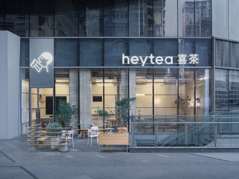
▼Overall view of the store and the outdoor seating area © Yanyu Architectural Photography
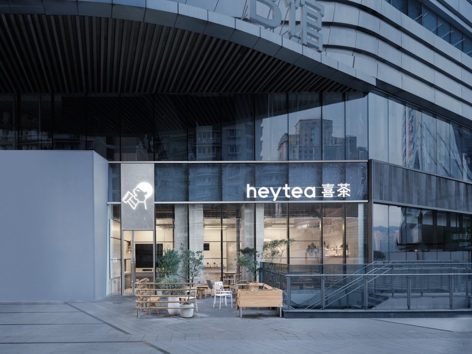

▼The storefront, The storefront © Yanyu Architectural Photography
For the Chongqing Jinsha Tianjie store, we finally settled on a more specific spatial concept – “tea shop on the wharf, drinking tea under the bridge”. In Chongqing, where the two rivers converge, the pier is the symbolic memory of the city; the unique mountainous landform also makes the dense elevated system a part of the urban landscape. As a result, there is another life scene belonging to Chongqing under the bridge: some people drink tea, some fish, some take a walk, and some just sit there, watching the river and the street scene. No matter where you are, you can maintain a sense of comfort close to daily life. It is this state of life that we want to bring into HeyTea, rather than a direct reproduction of piers, bridges or city symbols. A cup of tea can be a quick stop in a busy schedule, or it can be a place to sit down and have a slow chat. Therefore, the space does not need to emphasize itself all the time, but allows the relationship between architecture, materials, brand and people to be used naturally.
▼Design concept, concept diagram © Geemo Design
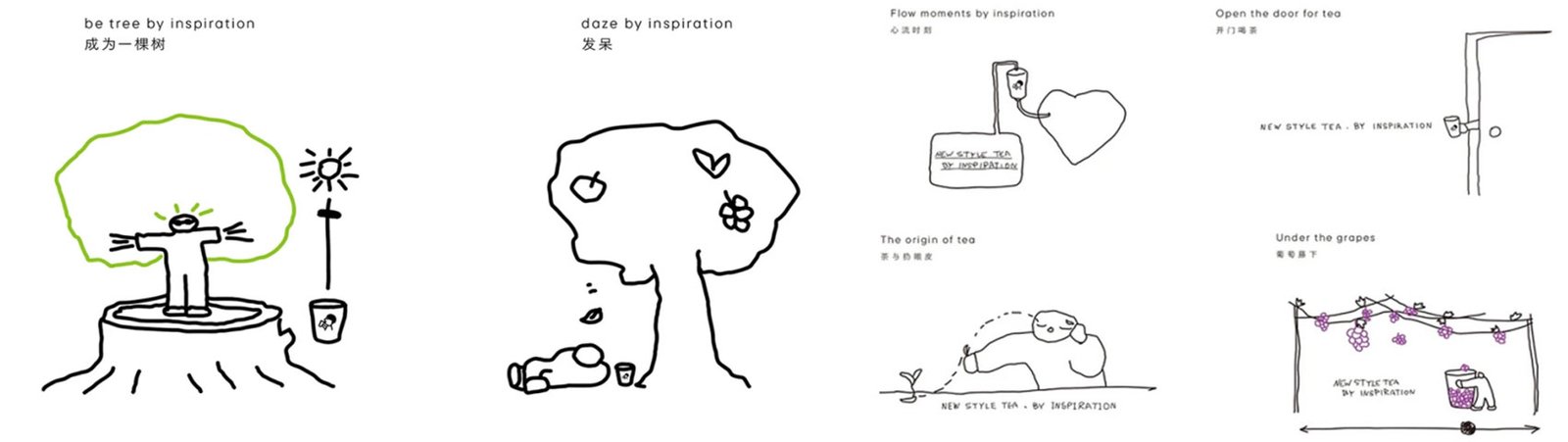

For the Chongqing Jinsha Tianjie store, we ultimately translated this thinking into a more specific spatial concept — “A Riverside Tea House Beneath the Bridge.” At the confluence of the two rivers, Chongqing carries a strong collective memory of its docks; its distinctive mountainous terrain has also made its dense network of elevated roads an integral part of the cityscape. there, watching the river and the city. No matter where we are, we can always retain a sense of ease rooted in everyday life. What we wanted to bring to HEYTEA was precisely this way of living, rather than directly reproducing the symbols of docks, bridges, or the city itself. A cup of tea can be a brief pause during a hurried journey, or an invitation to sit down and have a slow conversation. The space, therefore, does not need to constantly emphasize itself, but instead allows, materials, the brand, and architecture human use to naturally come together.
▼The outdoor seating area © Yanyu Architectural Photography
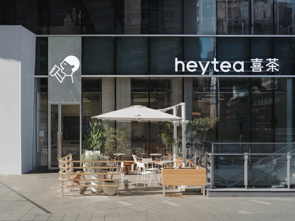
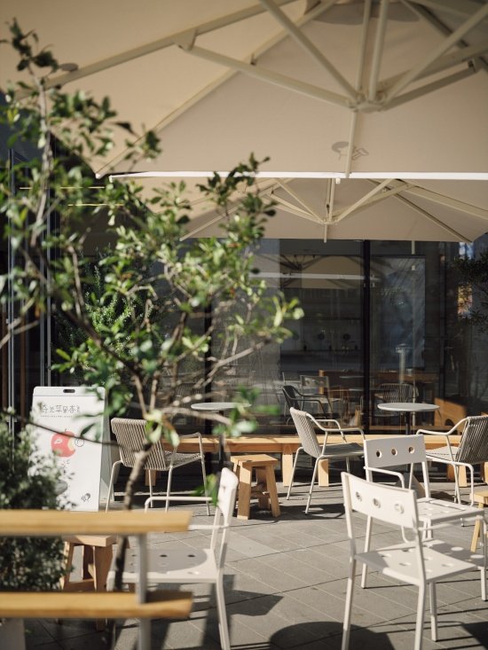
▼The parasols and seats in the outdoor area,
Umbrellas and seating in the outdoor area © Yanyu Architectural Photography

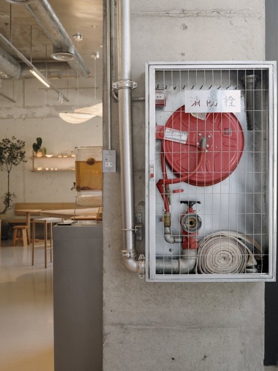
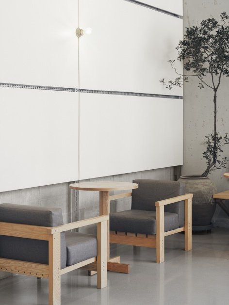
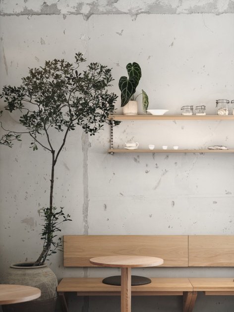
In terms of space treatment, we retained the fair-faced concrete columns, original cement walls and partially exposed metal pipelines, without rushing to repackage them with decoration. The roughness of the cement and the calmness of the metal contrast with the warmth of the wood, the softness of the fabric and the warmth of the light. Different materials retain their own textures, which also makes the space lose some traces of deliberate uniformity. The “clumsy” here does not mean roughness, nor does it reduce the completion of the space, but allows the materials to retain their true state so that the space does not need to be over-modified; the “interest” does not only come from decoration, but occurs between people and the use of space. A table spread out around a column, a beam of projection falling on the wall, and a place where people are willing to sit can all become a relaxing moment in daily life.
In our treatment of the space, we retained the exposed concrete columns, raw cement walls, and some exposed metal piping, without rushing to repackage them with decorative finishes. The roughness of cement and the coolness of metal are contrasted with the warmth of wood, the softness of textiles, and the warmth of lighting. Each material retains its own character, allowing the space to avoid the traces of excessive uniformity. Here, “simplicity” does not mean roughness, nor does it mean compromising the level of completion. Rather, it means allowing materials to retain their authentic state, without over-refining the space. Playfulness does not simply come from decoration either; it emerges through the relationship between people and the space. A table built around a column, a beam of light falling across a wall, or a place that makes people want to sit down can all become a lighthearted moment in everyday life.
▼Overall view of the interior © Yanyu Architectural Photography
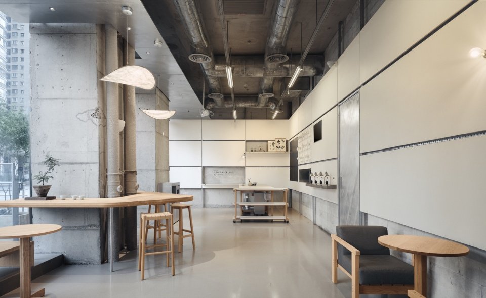

▼The communal table arranged around the column © Yanyu Architectural Photography
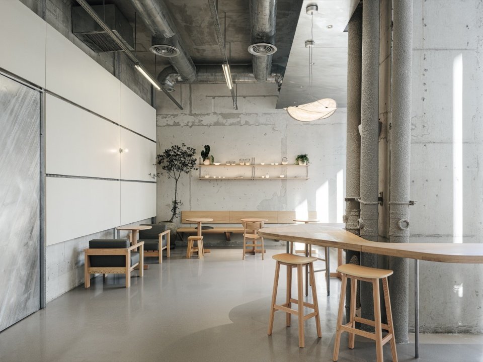
▼Bench seating against the raw cement wall, Bench seating against the raw cement wall © Yanyu Architectural Photography
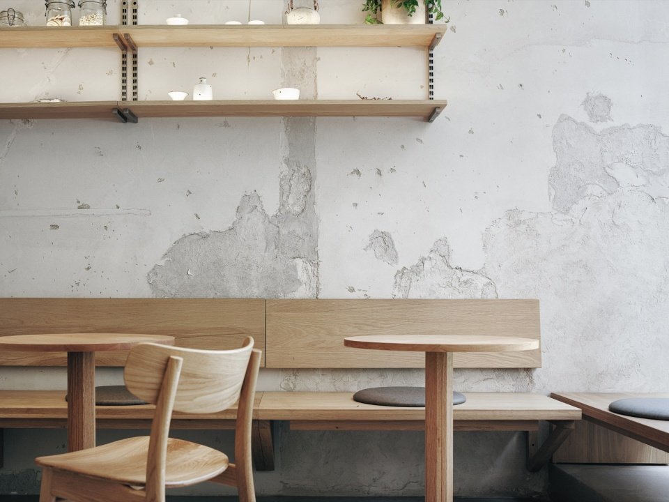
Commercial spaces certainly need order. A store is first and foremost a system that needs to continue to operate. Ordering, making, picking up, waiting and being seated all require clear relationships. Therefore, we put order into the scale, movement and functional organization of the space, rather than letting it become an overly strong visual form. The modular walls establish a basic scale relationship, while the original walls retain some changes, allowing regularity and irregularity to coexist.
Commercial spaces, of course, need order. A store is first and foremost a system that needs to operate continuously. Ordering, preparation, pickup, waiting, and seating all require clear relationships. Therefore, we integrated order into the scale, circulation, and functional organization of the space, rather than turning it into an overly dominant visual expression. Modular wall elements establish a basic sense of scale, while the original walls retain certain variations, allowing regularity and irregularity to coexist.
▼The seating area by the window © Yanyu Architectural Photography
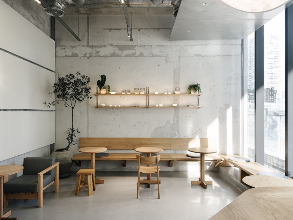
▼Exposed metal piping © Yanyu Architectural Photography
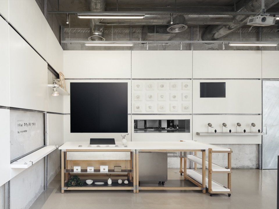
This set of ideas also extends to brand “standard products”. For commercial stores, logo, bar, equipment, display materials and operation systems are all parts that cannot be bypassed. They ensure brand identity and efficient store operation. Rather than trying to hide these standardized elements, we thought about how they fit into concrete spaces. The bar is not only the core of production and service, but also the location where customers most directly perceive the brand after entering the store. Therefore, equipment, user interfaces, walls, lights and materials are considered in the same spatial relationship from the beginning. The parts that need to be unified are kept standard, and the parts that need to respond to the architectural scale and material relationship are reorganized through interfaces and details. Standardization ensures brand consistency, while space design allows the same set of standards to have its own character in a specific place.
This thinking also extends to the brand’s standardized elements. For a commercial store, the logo, counter, equipment, display materials, and operational system are all essential components. They ensure brand recognition while supporting efficient operation. Rather than trying to hide these standardized elements, we considered how they could enter and belong to the specific space. The counter is both the core of preparation and service, and one of the first places where customers directly encounter the brand. relationship. The elements that need to remain consistent stay standardized, while those that need to respond to the architectural scale and material relationships are reorganized through interfaces and details. Standardization ensures brand consistency, while spatial design allows the same set of standards to develop its own character within a specific place.
▼The modular wall © Yanyu Architectural Photography
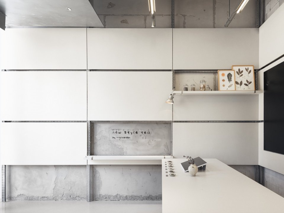
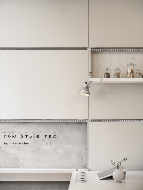
▼Details of the modular wall, Details of the modular wall © Yanyu Architectural Photography

Ranking is also a small but very specific example. Instead of letting an independent screen become the visual object in the space, we used a projector to arrange the order, so that the meal pickup information fell directly on the wall. The functions are still clear, but the space occupied by additional devices on the interface is reduced. The projection follows the light falling on the wall, the information is seen, and the wall changes accordingly.
The queue-number system is another small but very concrete example. Instead of letting a standalone screen become a visual object in the space, we used a projector to display queue numbers, projecting pickup information directly onto the wall. The function remains clear, while reducing the amount of additional equipment occupying the spatial interface. As the projection falls across the wall, the information becomes visible, while the wall itself also changes with it.
▼The counter © Yanyu Architectural Photography
▼Brand lettering on the wall © Yanyu Architectural Photography
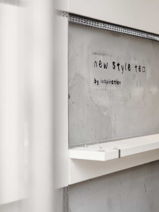
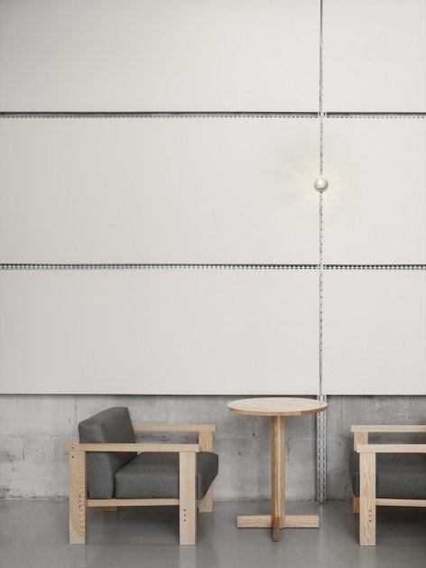
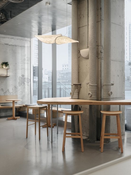
What was originally a purely operational function has become part of the space. What we care more about is letting these things that happen every day enter the design in a natural way, rather than redesigning them for a “design sense”. The same is true for people’s stay. The long wooden table set around the column allows the original architectural structure to participate in people’s activities; high seats are suitable for short stays, while wooden seats and fabric sofas are suitable for longer sitting and communication. Different seating relationships are not deliberately organized into a complete visual composition, but correspond to different usage states. Because the real attraction of “tea under the bridge” is never a certain form, but the feeling of being able to stop.
A function that originally belonged purely to store operations thus becomes part of the space. What we care more about is allowing these everyday occurrences to enter the design naturally, rather than redesigning them simply for the sake of creating a sense of “design.” The same thinking seating applies to how people use and occupy the space. A wooden communal table arranged around a column allows an existing architectural structure to participate in human activity; high stools accommodate shorter stays, while wooden chairs and upholstered sofas correspond to longer periods of sitting and conversation. a complete visual composition, but instead respond to different ways of using the space. Because what truly attracts people to drinking tea beneath the bridge is never a particular form, but rather the feeling that you can simply stop for a while.
▼Round table with columns and high stools,
The round table and high stools around the column © Yanyu Architectural Photography
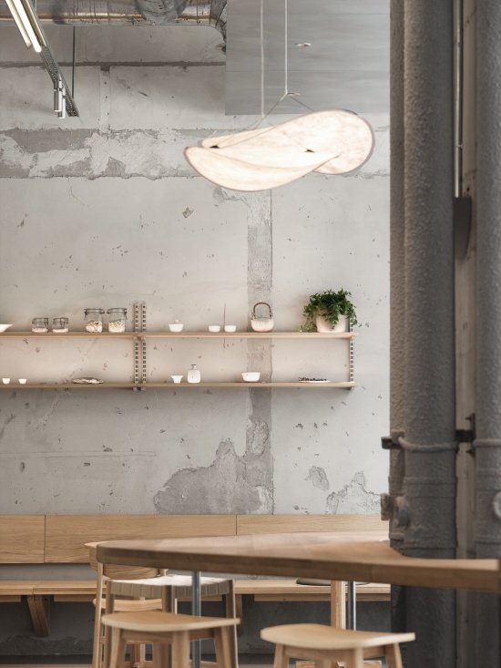
▼Storage rack and cloud chandelier,
Shelving and the cloud pendant lamp © Yanyu Architectural Photography
Some people pass by, some are waiting for a cup of tea, some sit down and chat, and some are willing to stay a little longer. For commercial spaces, people are not arranged moving nodes, but users who constantly change their status. We want the space to accommodate these changes.
Some people pass through, some wait for their tea, some sit down to chat, and others may choose to stay a little longer. In a commercial space, people are not simply points along a predetermined circulation route; they are users whose states continually change. We hope the space can accommodate these changes.
▼Wooden chairs and greenery, Wooden chairs and greenery © Yanyu Architectural Photography
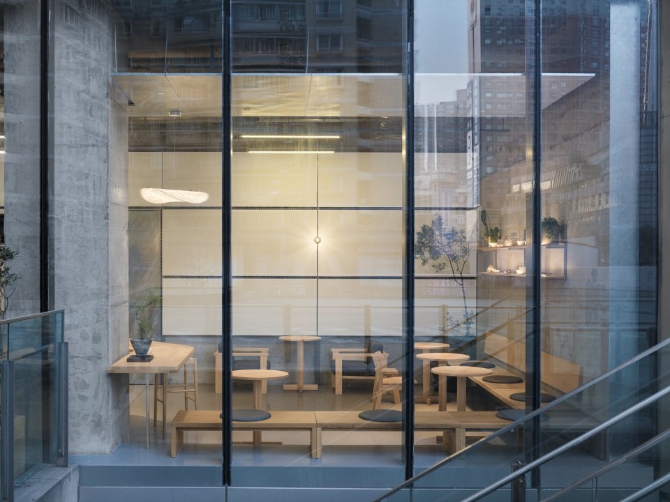
Jinsha Tianjie itself is also an open and high-flow commercial environment, so the store does not completely separate the interior from the exterior. The glass interface allows the flow of the street into the interior, and the seating relationship extends outwards. People’s stay, lighting and indoor activities have also become part of the urban interface. From passing by, to seeing, to entering, ordering, waiting and sitting down, these actions are not deliberately choreographed, but are naturally connected in spatial relationships. Therefore, “tea shop on the pier, drinking tea under the bridge” to us is not about moving a certain city symbol of Chongqing into the store. It is more like a spatial attitude: let the materials retain their own status, let the standardized brand system naturally enter the space, so that the function does not have to be a visual burden, and it also allows people to have a little room to stop while having a cup of tea.
Jinsha Tianjie itself is an open and highly dynamic commercial environment, so the store does not create a strict separation between interior and exterior. The glass façade allows the movement of the street to enter the space, while the seating extends outward. The presence of people, lighting, and activities taking place inside also become part of the urban interface. From passing by, to noticing, entering, ordering, waiting, and sitting down, these actions are not deliberately choreographed, but become naturally connected through spatial relationships. So for us, “A Riverside Tea House Beneath the Bridge” is not about transplanting a Chongqing city symbol into the store. It is more like a spatial attitude: allowing materials to retain their own state, allowing the standardized brand system to naturally enter the space, allowing functions to exist without becoming a visual burden, and giving people a little room to pause during the time it takes to enjoy a cup of tea.
▼A closer view of the storefront © Yanyu Architectural Photography
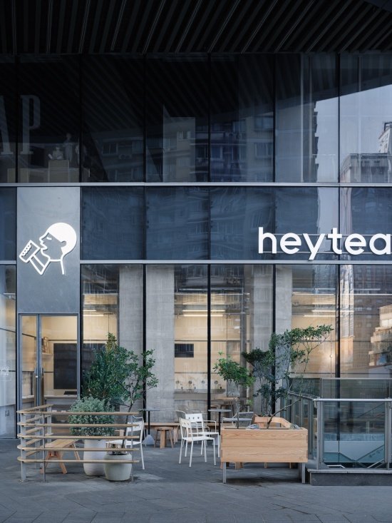
We believe that commercial space not only has efficiency and recognition, but also should accommodate some real life. We believe that standardization and individuality are not contradictory. What design really needs to solve is how to make the order of the brand and the character of the place coexist with each other. We also believe that relaxation is never arbitrary, but after fully understanding the function, order and people’s use, we are still willing to leave a little room. Perhaps, this is the commercial space we want—orderly, but not tight; well-designed, but not eager to express ourselves. Let the commercial space relax a little more.
We believe that commercial spaces are not only about efficiency and recognition; they should also accommodate the reality of everyday life. We believe that standardization and individuality are not contradictory. What spatial design truly needs to resolve is how the order of a brand and the character of a place can coexist. We also believe that relaxation does not mean arbitrariness. tense; designed, but not eager to express itself. Let commercial spaces be a little more relaxed.
▼Seating seen from outside looking at indoor seating © Yanyu Architectural Photography
Project name: HiTea·Jinshatianjie Store
Project type: Shop
Project address: Jinshatian Street, Shapingba, Chongqing
Main materials: stone, terrazzo, galvanized sheet, wood veneer, fabric
Completion time: 2026.06
Project area: 110㎡
Design company: GeemoDesign
Host design: Shi Chaosi, Yi Yi
Design team: Zhou Haibo
Photography team: Yanyu Architectural Photography
Client: HiTea
Company website: www.geemo.work
Contact email: geomodesign@foxmail.com
Project name: HEYTEA · Jinsha Tianjie Store
Program: Commercial Retail
Project location: Jinsha Tianjie, Shapingba, Chongqing, China
Main materials: Stone, Terrazzo, Galvanized Steel Sheet, Wood Veneer, Upholstery
Completion time: 2026.06
Area: 110㎡
Design firm: Geemo Design
Chief designers: Kirin, Yi
Design team: Bo
Photographer: Yanyu Architectural
Client: HEYTEA
Website: www.geemo.work
Contact e-mail: geemodesign@foxmail.com
More:GeemoDesign wood design. More about them:Geemo Design on gooood
Source: gooood.cn