


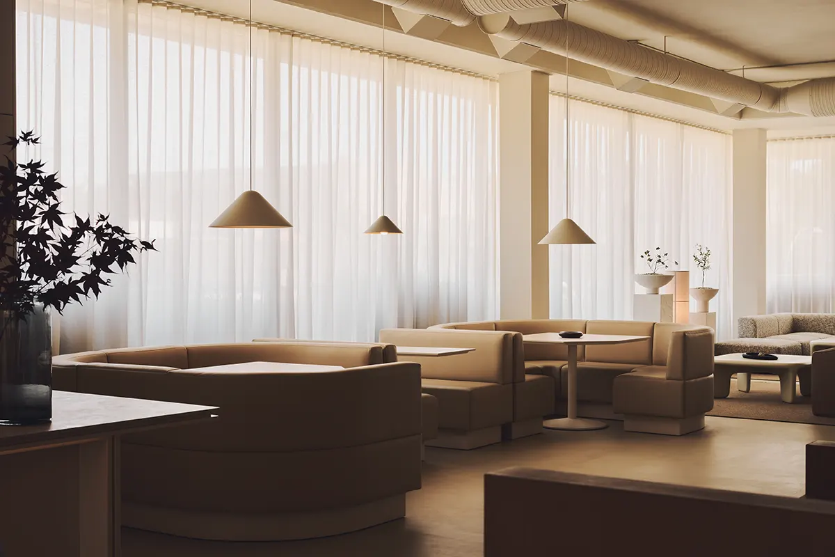
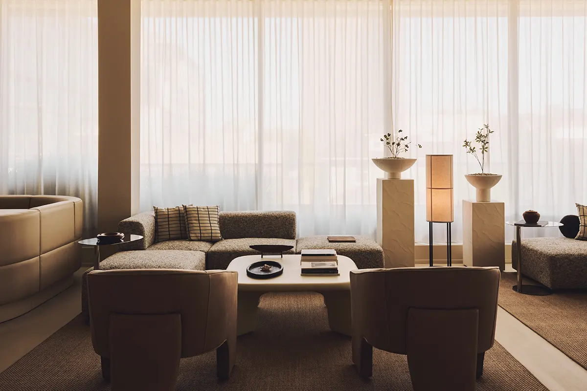
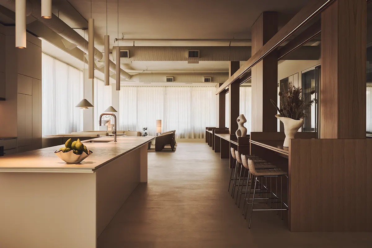

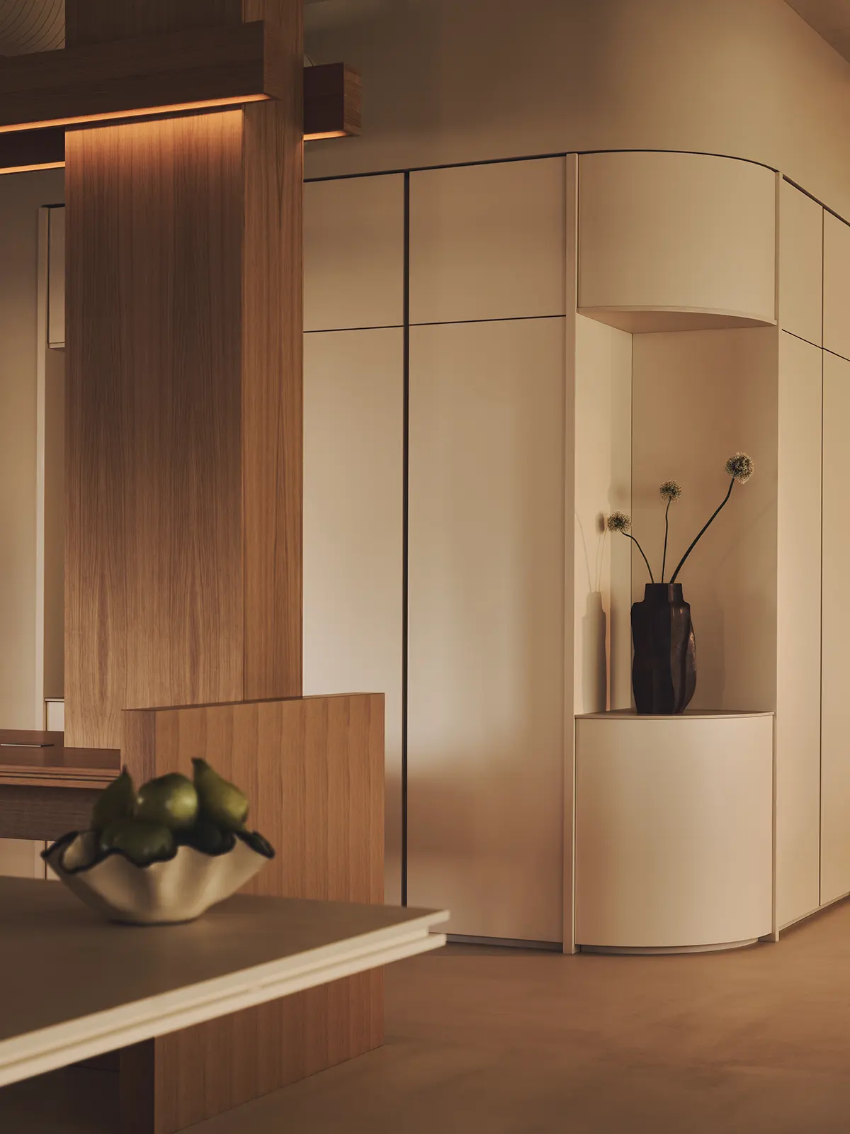
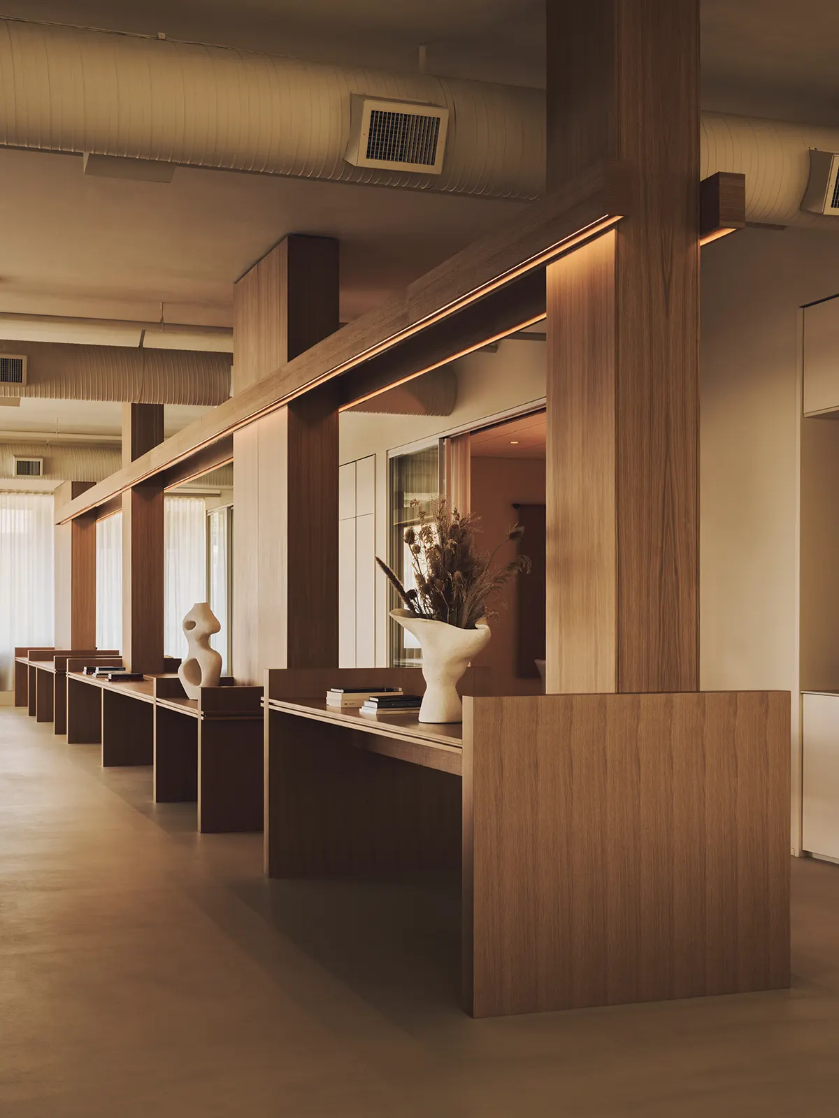

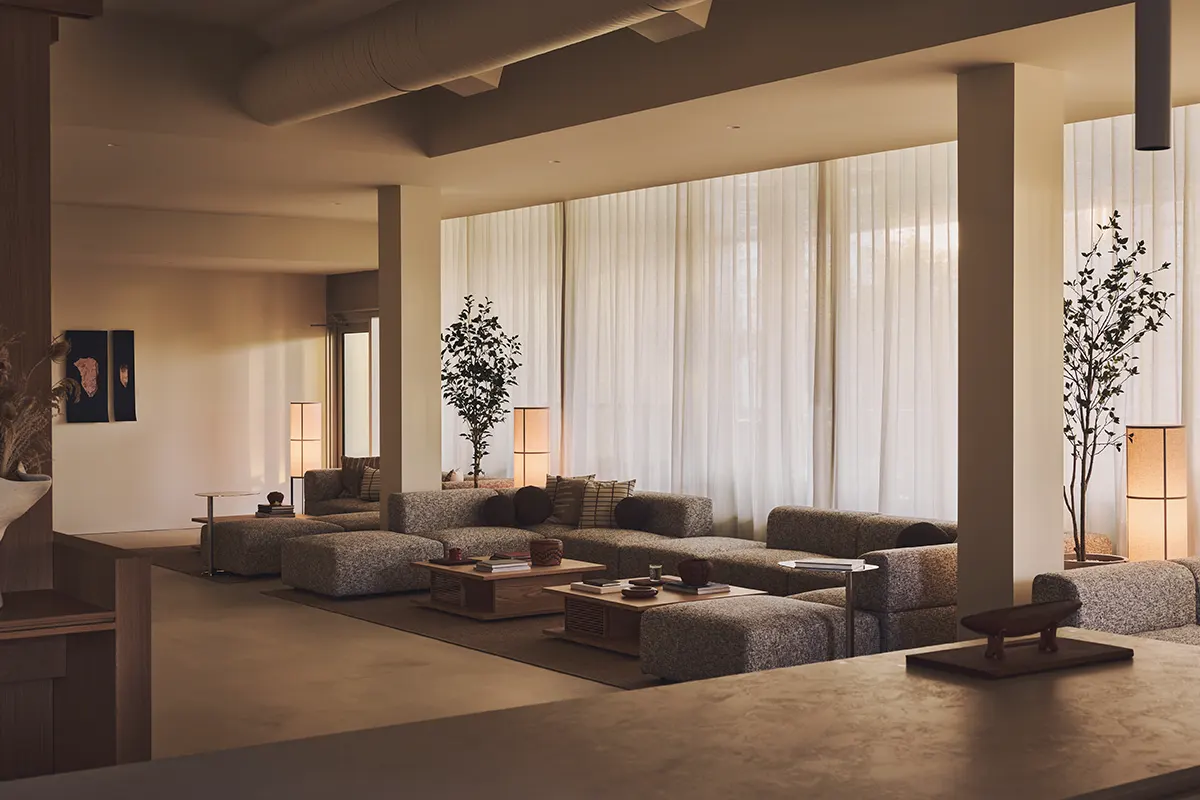

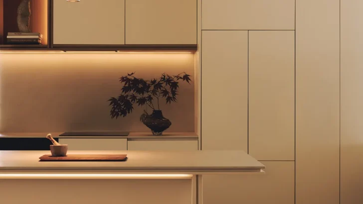
Ste Marie designs the new headquarters for Monos in Vancouver’s Mount Pleasant creative district, creating a 6,000-square-foot workplace that accommodates the travel brand’s expanding activities. Completed in December 2025, the project takes inspiration from residential and hospitality interiors, introducing an adaptable environment for daily work, product development, photography and social gatherings. A continuous communal table anchors the open plan, surrounded by low modular sofas, banquettes and custom rift-cut oak millwork. Polished concrete floors, natural-fibre rugs, woven textiles and sheer curtains establish a restrained material palette, while integrated lighting allows the atmosphere to change throughout the day. A kitchen and tea room extend the residential character, creating additional spaces for informal meetings and interaction.
The project considers how workplace design can accommodate the changing needs of a growing company while maintaining a personal and welcoming atmosphere. Speaking with ARCHISCENE Magazine Editor-in-Chief Zarko Davinic, the team at Ste Marie discusses the development of Monos HQ, from the decision to approach the workplace as an apartment to the role of furniture, materials and lighting in defining its character. The conversation examines the relationship between the studio and the Monos team, the importance of flexibility in a multifunctional environment and the design decisions that support different ways of working and gathering. Ste Marie also considers how the absence of traditional office hierarchies encourages interaction and creates a more welcoming environment for employees and collaborators.
Monos began as an e-commerce luggage brand. How did the brief evolve from “a workspace” into a space for hosting, product testing, and launches, and when did that broader scope become clear to you?
That was probably the first thing that became clear in the briefing. Monos was growing beyond its original identity as a luggage brand, and there was an opportunity to create a physical environment that could reflect that evolution. Our conversations with Hubert, Victor and their team were less about how many desks they needed and more about how they wanted to live and work together. They wanted somewhere that could accommodate the everyday, but also the occasional extraordinary moment. A place for a working session, a long lunch, a product presentation, a dinner with collaborators or an event.
We drew on our experience in residential and hospitality design to rethink the conventions of the workplace. The apartment became a useful reference point because apartments are inherently flexible and have that sense of familiarity that we were looking to achieve. They accommodate different people, different activities and different moods throughout the day. That shift in thinking really opened up the project. We weren’t designing a workplace that occasionally hosted events. We were designing a place that could move quite naturally between work, hospitality and brand experience.
You describe the studio as a “thought partner” as well as a designer. Which decisions came out of those conversations with the Monos team that you wouldn’t have made from the brief alone?
The biggest one was probably removing the traditional office hierarchy from the equation. There are no individual offices, no formal boardroom and no conventional reception desk. Those decisions came from understanding the way the Monos team actually operates. They’re a very integrated group, and the exchange of ideas between departments is fundamental to their culture. If we’d simply responded to a conventional office brief, we might have produced something perfectly functional, but it wouldn’t have been particularly Monos.
We also spent time talking about how people feel in a space. Hubert was very clear that he wanted the team to see the space as somewhere they would choose to spend time. A place that offers more than the necessities of work, with opportunities to connect, collaborate, learn, socialize or simply take a break.
That sounds simple, but it represents a meaningful shift in how we think about the purpose of a workplace. You’re no longer just solving for efficiency; you’re thinking about comfort, atmosphere, hospitality and the quality of time people spend together.
That’s where the relationship between designer and client becomes interesting. Sometimes our role is to challenge the brief, sometimes to give shape to an idea the client hasn’t quite articulated yet. It’s a conversation, and the project gets better when both sides contribute to it. Our role as a thought partner is to find the idea beneath the brief and give it a physical language. It’s about building a world that feels distinctly, unmistakably Monos.
We were designing a place that could move quite naturally between work, hospitality and brand experience.
The space is modelled on an apartment. What specific moves (furniture scale, the sofas and banquettes, the lamps, the planting) make it feel lived-in rather than like an office?
Scale is probably the biggest difference. Offices tend to be organised around the desk, whereas residential spaces are organised around how people gather. We wanted to reverse that thinking. The low modular sofas, the banquettes, the rugs and the more domestic lighting all contribute to that sense of comfort. The conical pendants have an anchoring presence without being overly decorative, and the floor and portable lamps introduce a much softer quality than you’d typically find in a workplace.
Then there’s the layering of materials. The natural fibres, upholstery, timber and planting bring a sense of life to the architecture. We didn’t want the space to feel overly designed or precious. It also needed to be somewhere you could put your bag down, make a coffee, have a conversation and feel completely at ease.
The central communal table is described as both a work surface and a display surface. How did you design it to handle a meeting, a meal, and a product shoot without the space feeling compromised for any of them?
We wanted the table to become the social anchor of the project. It’s intentionally generous, and its function is deliberately open-ended. It can be a working surface in the morning, a place to lay out new products in the afternoon and a dining table in the evening.
The architecture around it gives the table a sense of presence without making it feel like a conference room. It’s a simple idea, really: create a central place for people and things to come together, and let the activity define how it’s used.
The palette is monochromatic and restrained, built around rift-cut oak and polished concrete. Why did you choose that combination, and how did it hold up once photography and product styling began?
There’s a fine line between restraint and austerity, and the materiality is what makes the difference. The rift-cut oak has a beautiful linear grain. It’s quite architectural, but it also brings warmth and a natural quality to the space. The polished concrete gives us a harder, more elemental counterpoint. There’s a nice tension between the two.
We kept the palette deliberately restrained because Monos has a strong visual identity of its own. We didn’t want the architecture competing with the products or trying to impose another layer of branding. The headquarters needed to feel like an extension of the brand’s sensibility, and you want enough texture and depth to make an area inviting.
Offices tend to be organised around the desk, whereas residential spaces are organised around how people gather. We wanted to reverse that thinking.
Lighting shifts from focused work to evening gatherings. Can you walk us through how the dimmable, indirect lighting was zoned and what it took to get the evening atmosphere right?
Lighting is one of the things that can completely change the emotional quality of a space, and we were quite conscious of that here. The lighting needed to support focused work during the day, but also allow the environment to become much more intimate in the evening, so we used a combination of integrated architectural lighting, overhead conical pendants, and smaller decorative sources, including floor and portable lamps.
The dimmable and diffused elements allow the atmosphere to shift without having to change the physical arrangement of the space. In the evening, you want to move away from uniform illumination. You want a little more contrast, warmer pools of light and areas that feel naturally inviting.
That was particularly important given the different ways Monos intended to use the space. A town hall and a dinner party are obviously very different experiences, but the architecture should be able to accommodate both without feeling like a completely different place.
The banquettes and sheer curtains define intimate areas without closing them off. How did you balance privacy with openness, especially in a space that also doubles as a photography backdrop?
The banquettes give us the sense of privacy that we needed for the space. They’re comfortable, slightly more intimate places to sit, but they don’t interrupt the visual continuity of the headquarters. The sheer curtains do something similar. They introduce softness, a degree of privacy and a sense of layering, without becoming a hard architectural boundary.
For us, flexibility at its best is about creating environments to accommodate constant change and evolution. Sometimes that’s simply giving a room space to breathe.
The design leaves room for the company to keep evolving. What did you leave deliberately unfinished or flexible, and how do you think about a space that is meant to change?
We wanted the architecture to be quite resolved, but the way it could be occupied to remain open. The furniture can move, the central table can take on different roles, and the various gathering areas can accommodate activities that weren’t necessarily part of the original brief.
Monos is still evolving as a brand. Its world is expanding, and we didn’t want to create something that would feel dated or overly specific as that happens.
For us, flexibility at its best is about creating environments to accommodate constant change and evolution. Sometimes that’s simply giving a room space to breathe.
Monos’ culture is about openness, with employees, vendors, and the creative community all welcome. How did that shape the layout, the kitchen and tea room, and the choice to avoid a formal reception or boardroom feel?
The project doesn’t have that ‘traditional’ front door experience in the corporate sense. There’s no big reception desk announcing that you’ve arrived at an office. That was very intentional.
The kitchen and tea room are important parts to keep that feeling flowing. Both spaces are part of the social heart of the headquarters, and we wanted people to naturally gravitate towards them.
There’s a hospitality sensibility to that way of thinking. In a good hotel or restaurant, you’re not constantly being reminded of the function of the space, you simply feel welcome and at ease.
Monos spoke to us about the importance of making the time people spend together more meaningful, so we designed their headquarters to become a centre of gravity; a place to reconnect, exchange ideas, share a meal and build relationships.
Looking back at the completed project, what did Ste Marie learn from working on a brand that is still defining what it wants to be, and how do you see that lesson carrying into your next hospitality or retail commission?
The best spaces don’t just represent a brand, they help it move forward.
Client: Monos
Design: Ste Marie
Location: 2055 Columbia St Vancouver, Canada
Scale: 6000 sqft
Scope: Interior Design, Custom Furniture, FFE Specification, Styling
Completion Date: December 2025
Photography: Conrad Brown
Construction Partner: Mercury Contracting
Architect of Record: Danny Wong
Source: https://www.archiscene.net