

























grateful Borrowing Light Practice Architectural Design Studio Share on gooood. More about:Enlightenarch studio on gooood.
Appreciation towards Enlightenarch studio for providing the following description:
·
Project overview
Project overview
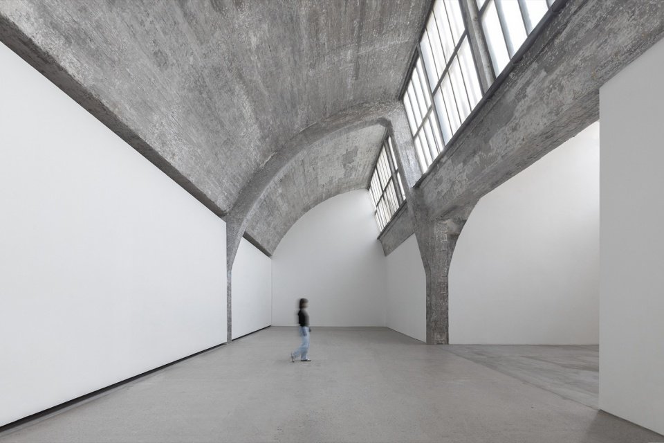
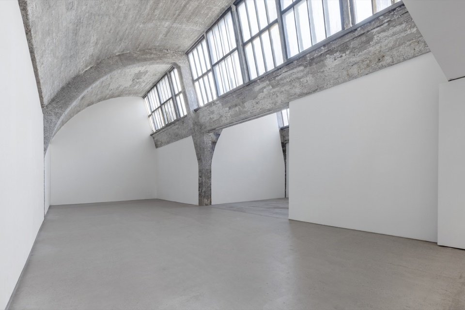
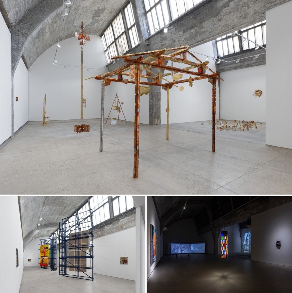
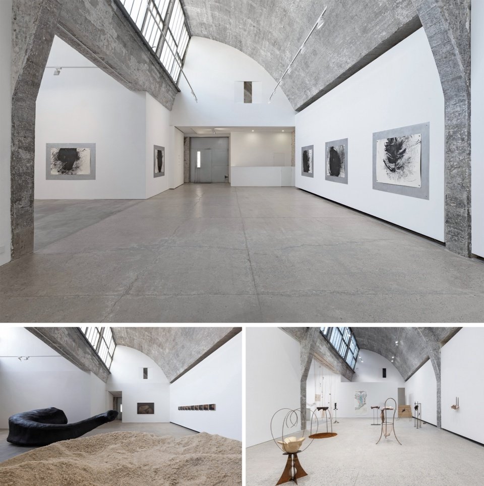
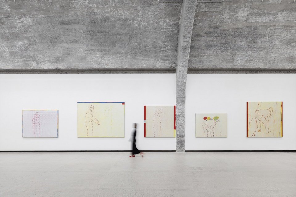
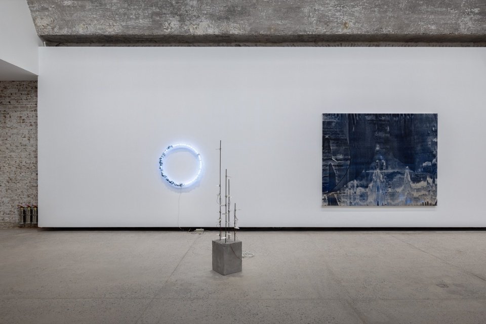
REFLEXION is located in a traditional Bauhaus building in Beijing’s 798 Art District. It is a contemporary art gallery with artists as the core and art as the driving force. The overall renovation sequence is to first remove the parts added by the previous tenants, restore the original historical appearance of the building, and then carry out a secondary renovation design based on the functions. Therefore, the overall renovation design is not to strengthen the new form, but to make a low-key intervention through the selection of materials and restrained shapes on the premise of showing the original architectural style. And try to use the architectural space as much as possible to set off the charm of the art works, so that the space and the art works can have a dialogue.
REFLEXION is in a traditional Bauhaus building in Beijing’s 798 Art District. It is a contemporary art gallery focused on artists and their work. The renovation began with the removal of additions made by previous tenants, restoring the building’s original historic appearance; a second phase of design was then carried out in response to functional needs. The design does not set out to assert a new formal language. Rather, while revealing the original architectural character, it intervenes discreetly through material choices and restrained forms. The architecture itself is used to frame the artworks and bring space and art into dialogue.
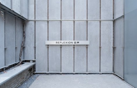
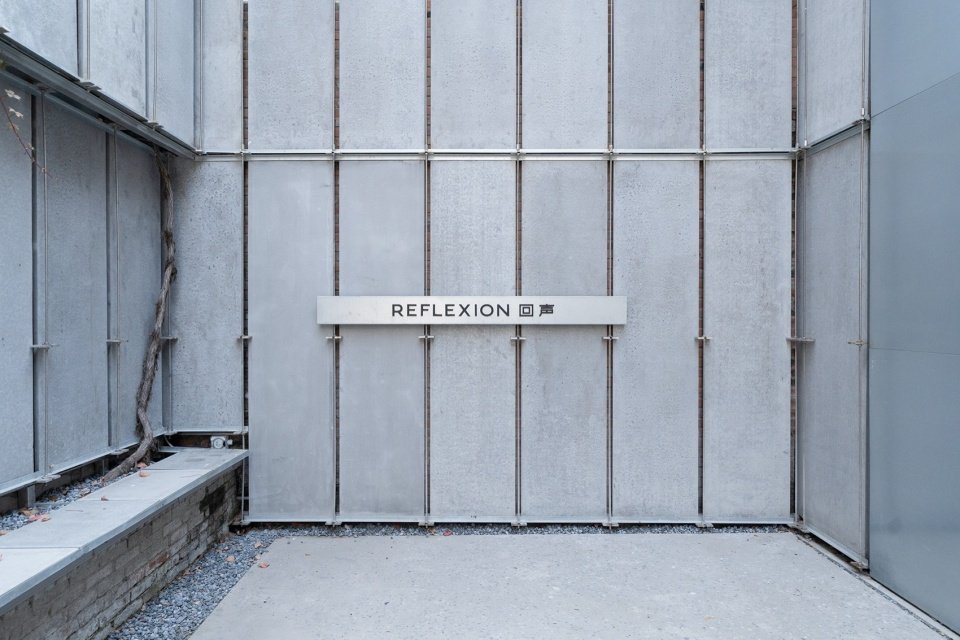
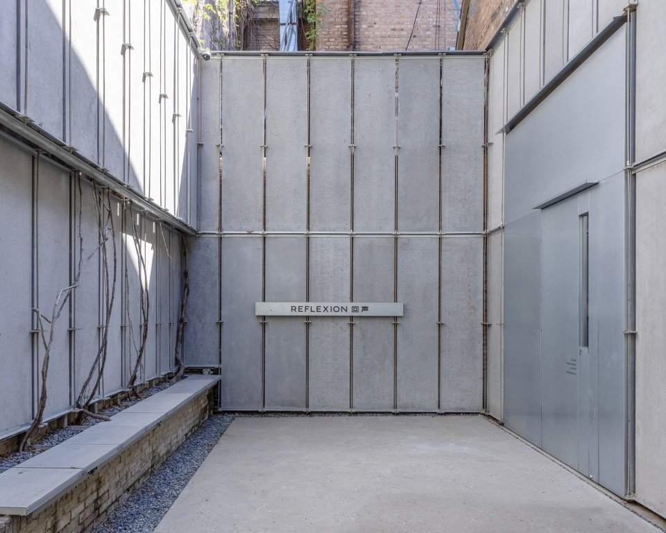
▼Design of the entrance logo wall, Design of the entrance logo wall © Chen Guanghui
facade design
Facade design
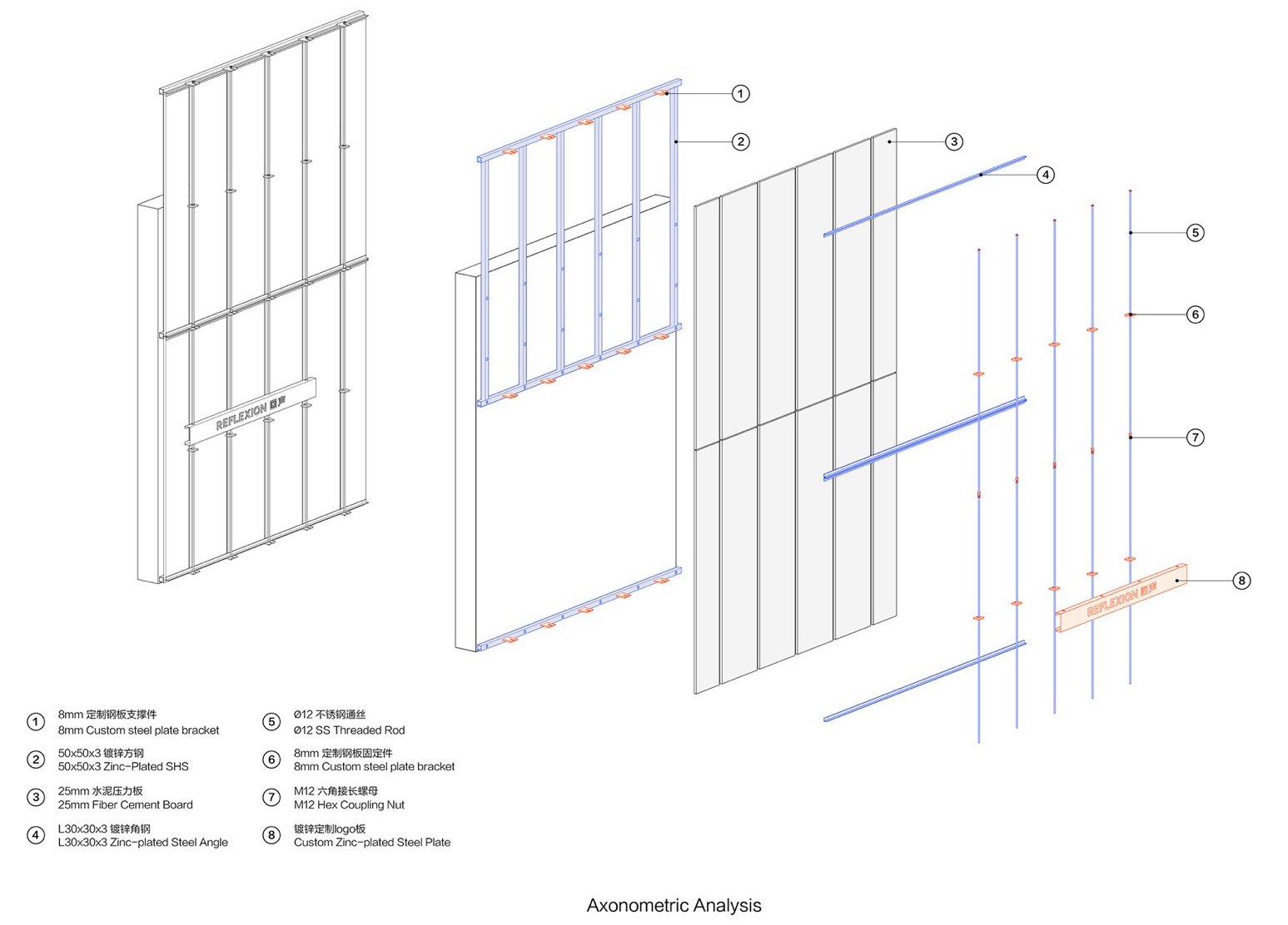
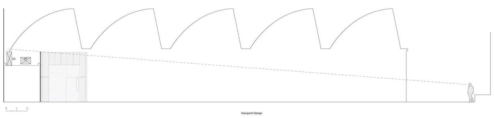
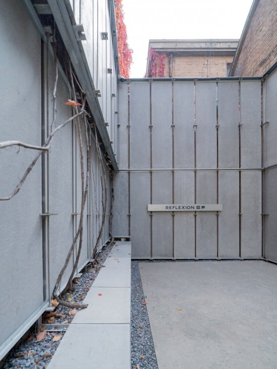
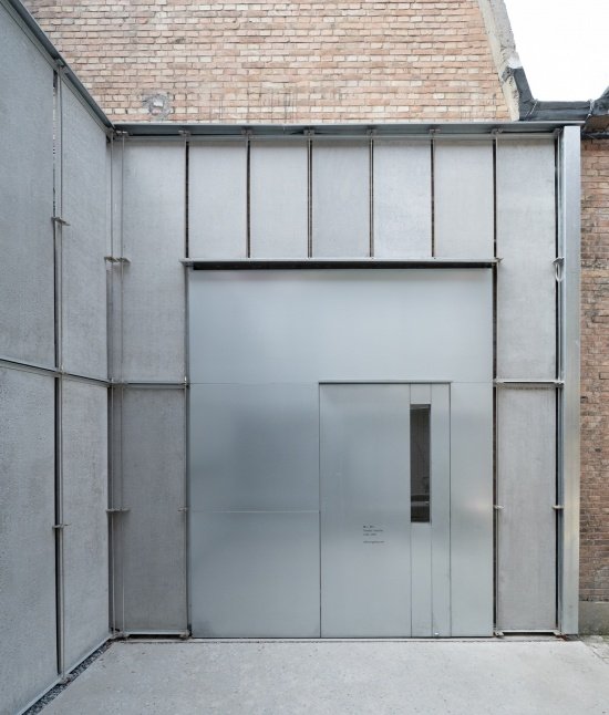
The entrance to the space is located at the end of the alley and is enclosed by three buildings with different facade materials. In order to avoid the disconnection between indoor and outdoor, the main material of the external space is cement pressure board: it is based on cement and has a mottled texture of concrete when it leaves the factory, echoing the indoor concrete. The panels are divided and fixed in 1/2 to reduce losses and control costs; the vertical and regular arrangement enhances the sense of upward space and echoes the proportion of the north window in the room; the panel height is just right to block the cluttered equipment behind. Slab seams allow the façade to breathe and reveal the original facade condition. The panels are fixed by small components, and the exposed slender metal components can contrast with the thick panels and enrich the facade hierarchy.
The entrance sits at the end of an alley, framed by the different facade materials of three buildings. To avoid a between interior and exterior, the exterior space is clad primarily in cement boards. Cement-based, the disconnect boards come from the factory already mottled like concrete, echoing the concrete inside. They are cut in half before installation to reduce waste and control cost. Their regular vertical arrangement reinforces the sense of verticality and echoes the proportions of the north windows within. The board height is calibrated to screen the clutter of equipment behind. Gaps between boards let the facade breathe and reveal the existing wall behind. The boards are secured with small fittings; the exposed slender metal elements contrast with the heavy panels, adding depth to the facade.
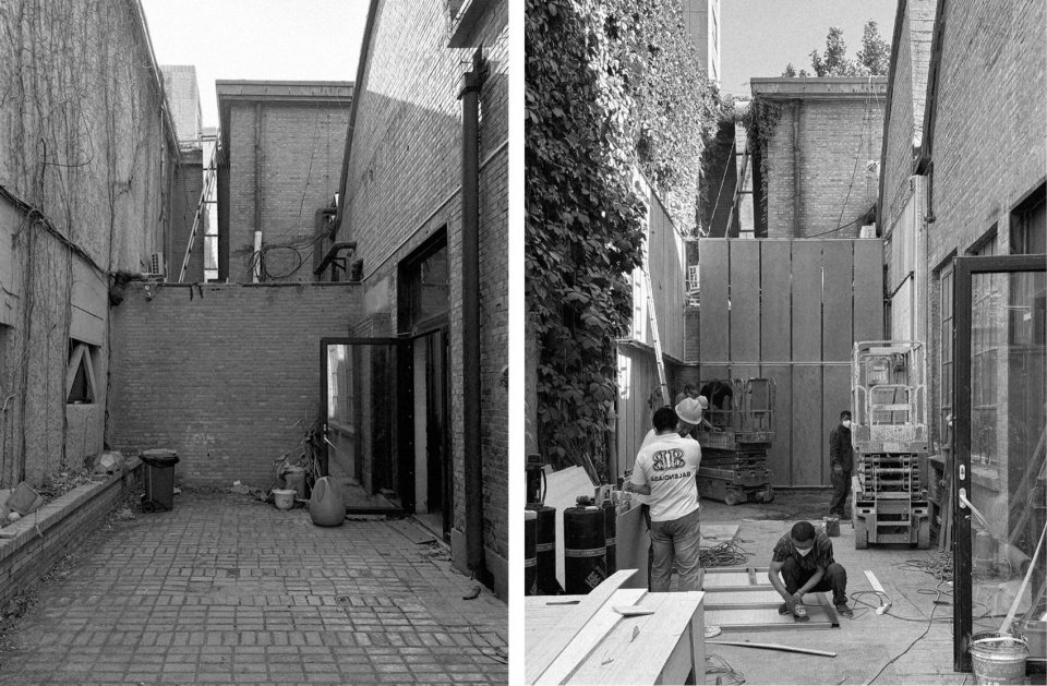
▼Exterior facade under construction photos © Chen Guanghui
▼Facade construction analysis diagram, Facade construction analysis diagram © Borrowing Light Practice Architectural Design Studio
▼Use the facade height to screen the rear roof equipment, Rooftop equipment screened by the facade height © Borrowing Light Practice Architectural Design Studio
Through the above unified material medium and structural language, the material differences of the original facade are weakened and play the role of strengthening the external space itself. The entrance thus forms another transitional space—both a public space and a semi-open room, with the sky serving as its suspended ceiling. Entering the interior from the entrance is like entering a closed room from a semi-open room.
These consistent materials and details soften the differences among the original facades and reinforce the exterior space itself. The entrance thus becomes another transitional space—at once public and semi-open, with the sky as its ceiling. Passing from the entrance into the interior is like moving from a semi-open room into an enclosed one.
▼Space enclosed by exterior facades © REFLEXION
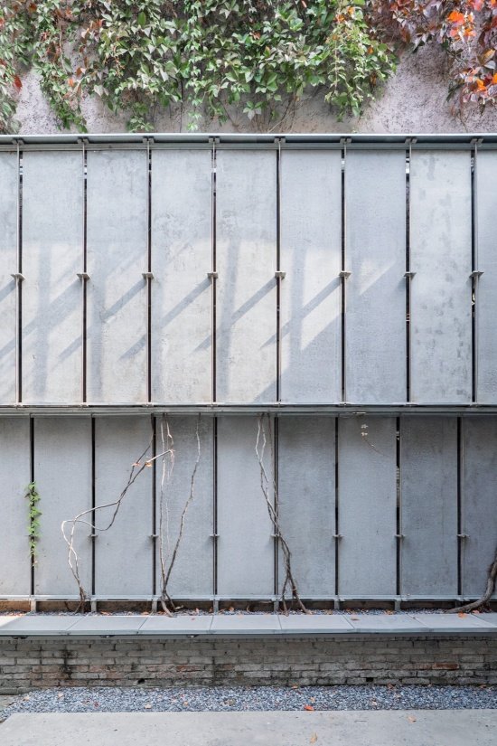
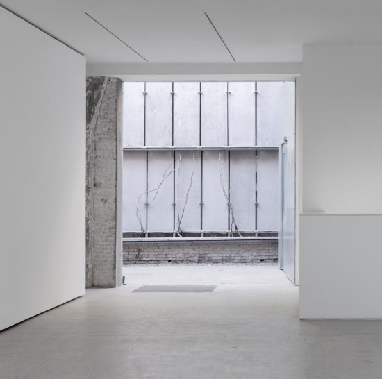
On the west facade, the panels are shifted forward and backward to leave space for the vines in the flower pond to grow, and the vertical tie bars can double as climbing supports. A seating surface of the same material was added next to the original flower pond to enhance the sense of staying in the space.
On the west facade, the panels are offset in depth to leave room for the vines in the planter to grow, with the vertical tie bars doubling as climbing supports. Seating surfaces of the same material have been added along the edge of the existing planter, encouraging people to linger.
▼The relationship between plants and facade on the west side, West facade and planting © Chen Guanghui
▼Look at the climbing plants and seating surfaces on the west facade,
West facade with climbing plants and seating © Chen Guanghui
entrance design
Entrance design
In terms of material selection, we chose unglazed galvanized sheets, which echo the cement pressure boards in color and grayscale, but the differences in texture differentiate the functions. The door body adopts the door-in-door form: it can be fully opened when large exhibits are admitted, and a small door is used for daily viewing. In terms of shape, the door handle is weakened, the observation window is highlighted, and redundant elements are stripped away as much as possible. The texture and color of galvanized sheets are used to create a certain sense of alienation, which can avoid some crowds and avoid disturbing the internal exhibition atmosphere.
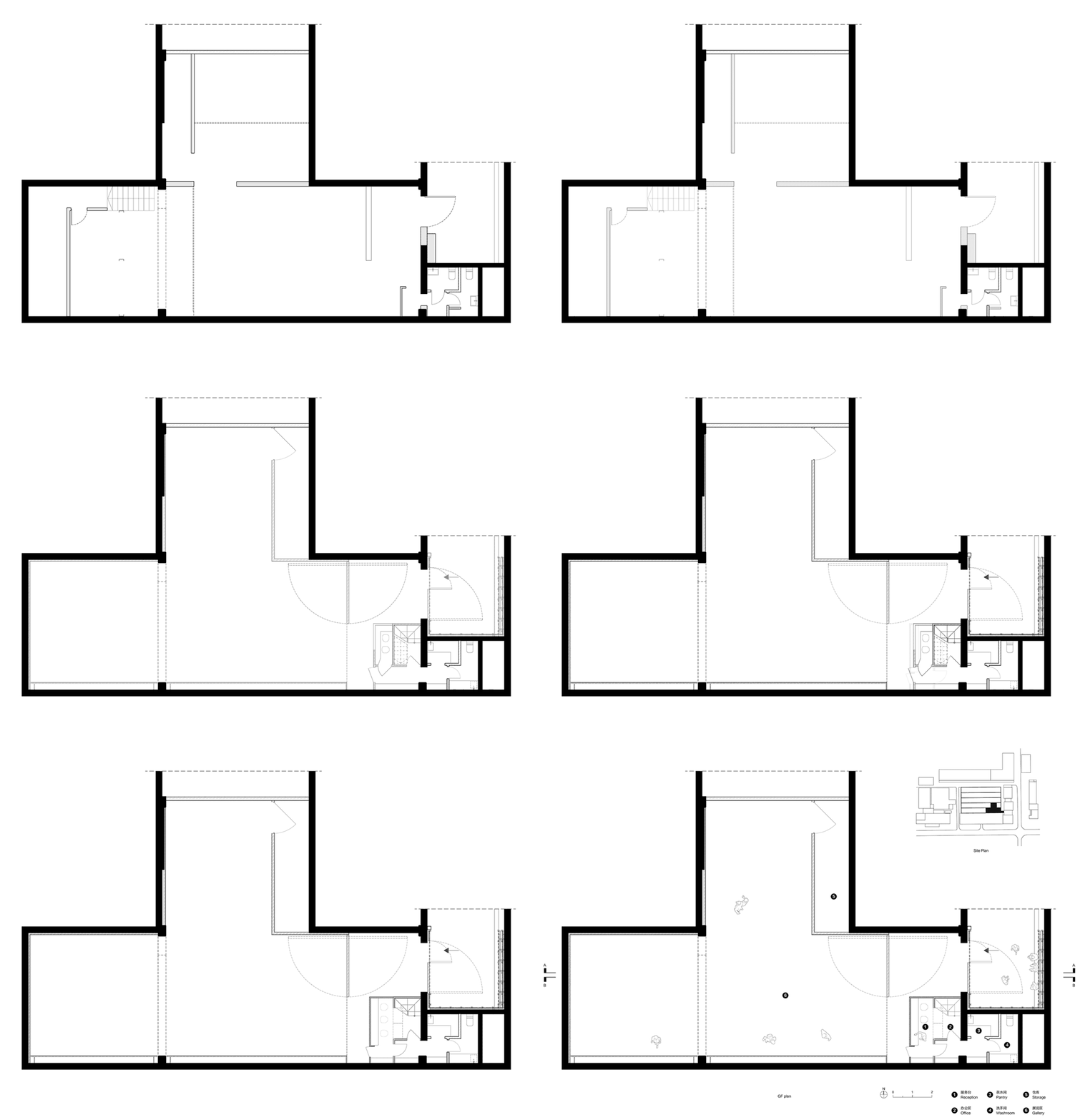
▼Floor plan of the renovation design process,
Floor plans of the renovation design process © Borrowing Light Practice Architectural Design Studio

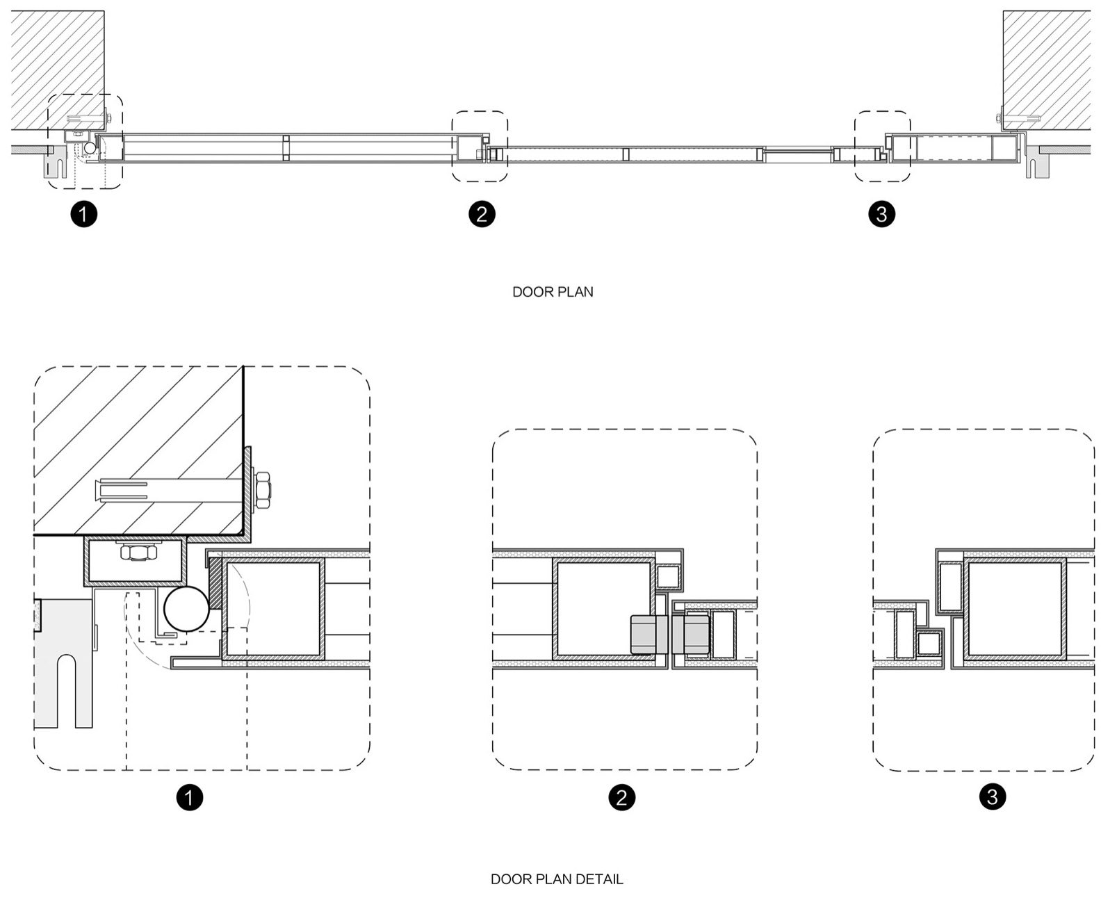
Spangle-free galvanized steel was chosen for the entrance. Its gray tone echoes that of the cement boards, while its different texture signals a different function. The door is designed as a door-within-a-door: the main leaf opens fully to admit large artworks, while the small door is used for everyday viewing. The handle is visually subdued and the vision panel emphasized, with superfluous stripped elements away wherever possible. The texture and color of the galvanized steel create a certain distance that keeps some passers-by out and protects the viewing atmosphere inside.
▼The Door-within-a-Door at the entrance © Chen Guanghui
▼Looking at the open door from indoors,
Looking out from Inside towards the open main door © REFLEXION
Interior design: restore the original material texture and establish a restrained and dialogue relationship between the old and the new
Interior Design: Restoring the original fabric and establishing a restrained dialogue between old and new
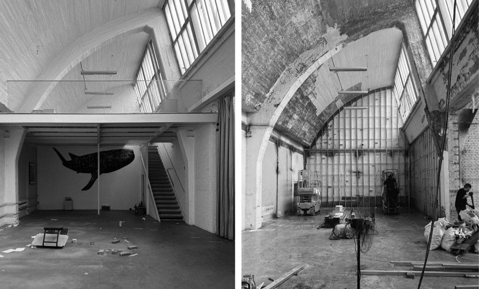
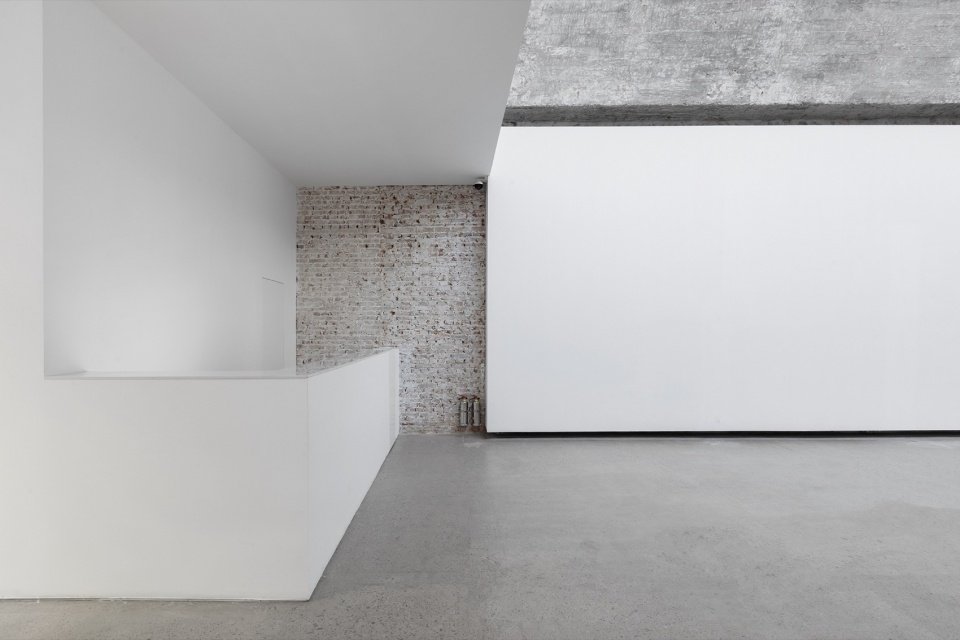
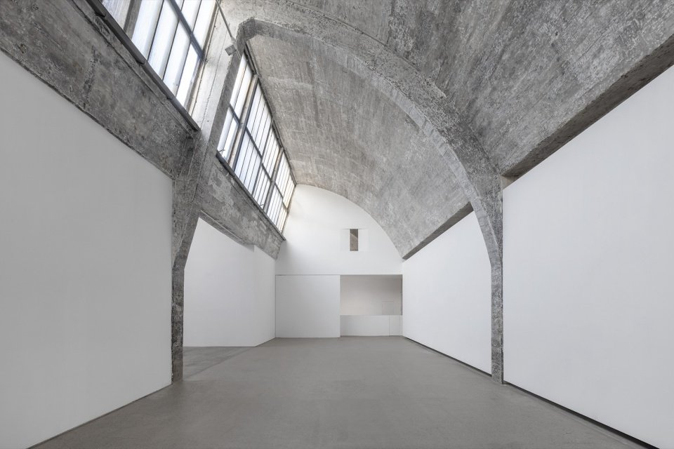
For the interior renovation, the previous tenant’s additions were first demolished, and the concrete texture and red brick texture covered with white paint were restored. The ground was cleared and polished after self-leveling, and the dry polished concrete process was used to reappear the original aggregate texture and present the original ground materials in another way. In the end, some white paint still remains in the concrete gaps between the roof and the pillars and the mortar joints in the red brick walls, creating a breathable and relaxed feeling.
▼Indoor construction site photos, Interior under construction © Chen Guanghui
The interior renovation first involved the removal of additions made by previous tenants, restoring the concrete texture and red-brick character that had been concealed beneath white paint. The self-levelling compound was removed and the slab ground back; dry polishing then brought out the original aggregate, allowing the existing floor material to reappear through another technique. In the end, remnants of white paint were left in the concrete joints of the roof and columns and in the mortar joints of the red-brick walls, giving the space an airy, relaxed feel.
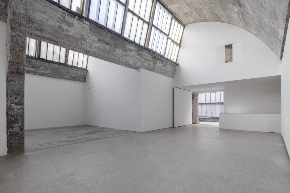
▼View towards the newly added white reception desk and display wall, the cleaned red brick, and the dry-polished concrete floor. © REFLEXION
The original building is the protagonist, and the renovation needs to play a supporting role, but it must be able to set off the exhibits during the exhibition. Therefore, the new interior space and exhibition walls are painted with white uniform paint to weaken its own character. At the same time, its simple shape is used to integrate the history and function of the original protagonist building, ensuring that it can maintain its own characteristics in the dialogue with the protagonist space and set off the artistic works.
The original building is the protagonist, and the renovation plays a supporting role—yet it must still set off the exhibits when they are on view. The new interior spaces and display walls are therefore finished in uniform white paint, subduing their own character. Their restrained forms allow them to be absorbed into the history and functions of the original building, while preserving their own identity in dialogue with the principal space and enhancing the presentation of the artworks.
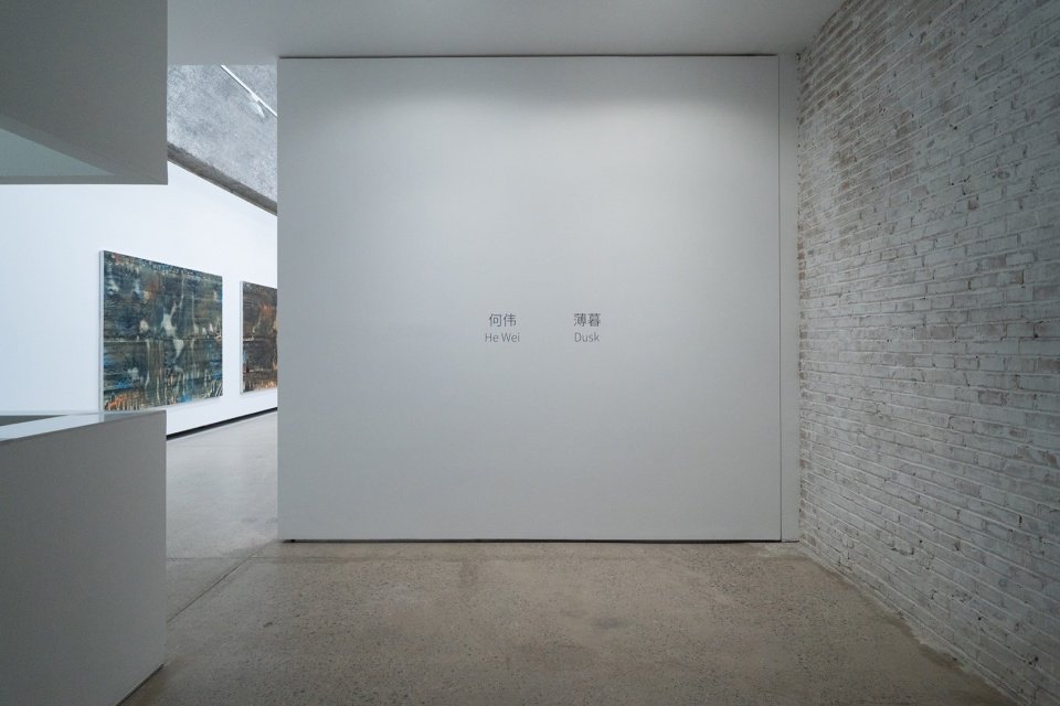
▼View towards the interior space © REFLEXION
▼View towards the interior from the reception desk © REFLEXION
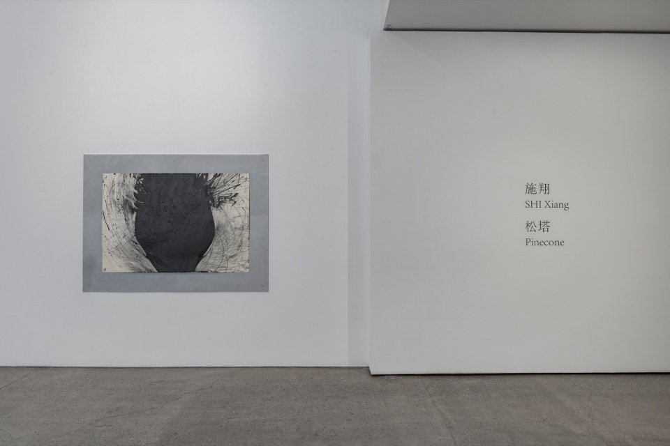
▼Various exhibition formats drawing on the spatial characteristics © REFLEXION
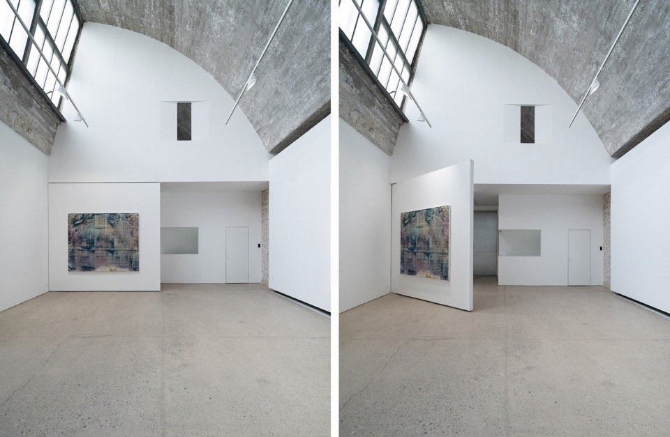
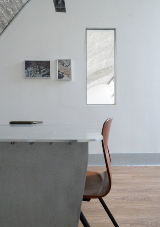
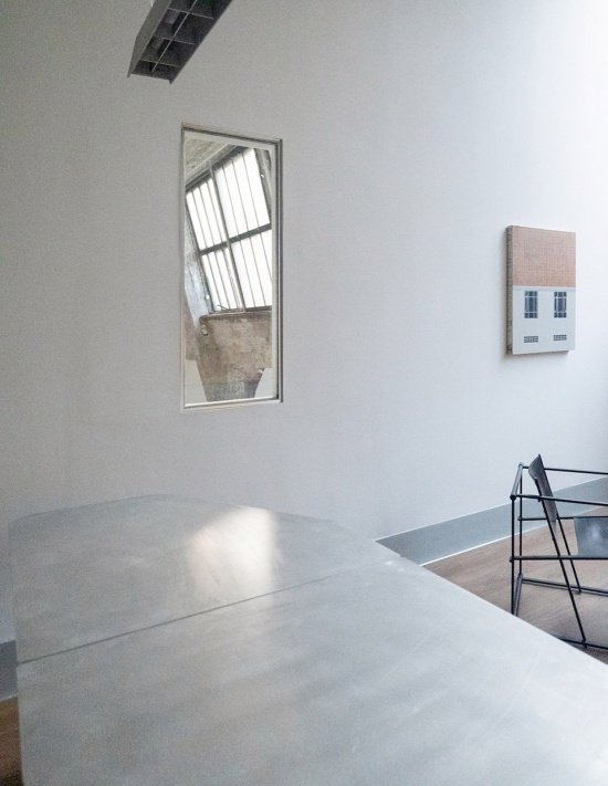
In terms of the moving line design, after entering the space, an openable and closable screen door plays the role of carrying the theme of the work, and at the same time plays the role of transition between indoor and outdoor spaces and stimulation of perception. By combining the logistics functions of the original space, the main functional space is divided into the entrance area in order to maximize the internal exhibition area. The windows on the second floor are used to create communication between the office and the exhibition area to avoid occlusion. At the same time, by cutting corners on the wall and reducing the window frame, the windows from the internal perspective look like a painting hanging on the wall.
▼Sketch of entrance functional block facade design,
Elevation sketch of the entrance volume © Chen Guanghui

In terms of circulation, upon entering the space, an operable screen door carries the exhibition’s theme and marks the passage from outside to inside, sharpening awareness of entering the space. By incorporating the original building’s back-of-house functions, the main service spaces are grouped at the entrance, so that the exhibition area inside is as large as possible. On the upper floor, window openings create a visual connection between the office and the exhibition areas, avoiding a sense of enclosure; chamfered wall corners and reduced window frames make the windows, seen from within, read as paintings hung on the wall.
▼How to use Interior entrance screen door, closed © Chen Guanghui
▼How to use interior entrance screen door, open © REFLEXION
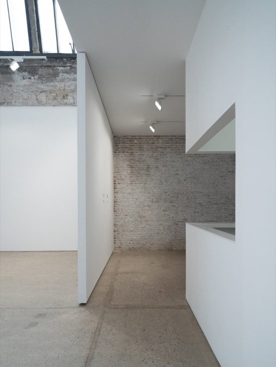
▼Viewed from the side with the entrance screen closed,
Entrance screen, closed — side view © Chen Guanghui
▼The operable screen door © Chen Guanghui
▼Entrance configurations in different exhibition formats © REFLEXION
▼Looking at the entrance reception area and second-floor windows, Entrance reception area and second-floor windows © REFLEXION
▼Look at the open entrance screen door and main entrance door, Open entrance screen and main entrance door © REFLEXION
▼Looking at the picture-like windows from the second floor interior,
Second-floor interior view towards the window as a framed painting © Chen Guanghui
The curved concrete roof is an important element of the original architectural style. In contrast, the newly added air conditioner, as a boring functional element, needs to minimize its impact on the curved roof to avoid reducing the quality of the space due to its appearance. Therefore, the air conditioner is hidden on the facade and suspended in the air, leaving gaps for air outlet and return air up and down. At the same time, the power supply system and emergency lighting are hidden in the gap under the wall.
The curved concrete roof is a defining element of the original architecture. The air-conditioning units, by contrast, are purely functional; we kept their impact on the curved roof to a minimum, so they do not detract from the space. They are therefore concealed within the facade, which is suspended to leave gaps above and below for supply and return air. The power system and emergency lighting are likewise concealed in the gap beneath the wall.
▼Supply and return air openings, suspended white facade © REFLEXION
▼The installation draws power through the gap at the base of the wall. © REFLEXION
furniture design
Furniture design
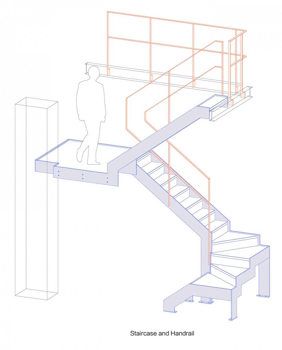
The stairs from the first to the second floor of the back-office area are limited by the space scale. Steel plates are used as the stair longitudinal beams and through-handrails are installed to reduce space occupation.
▼Isometric drawing of staircase design,
Stair Design Axonometric drawing © Borrowing Light Practice Architectural Design Studio

Because space is tight, the back-of-house stair between the first and second floors uses steel-plate stringers and a continuous handrail to keep its footprint small.
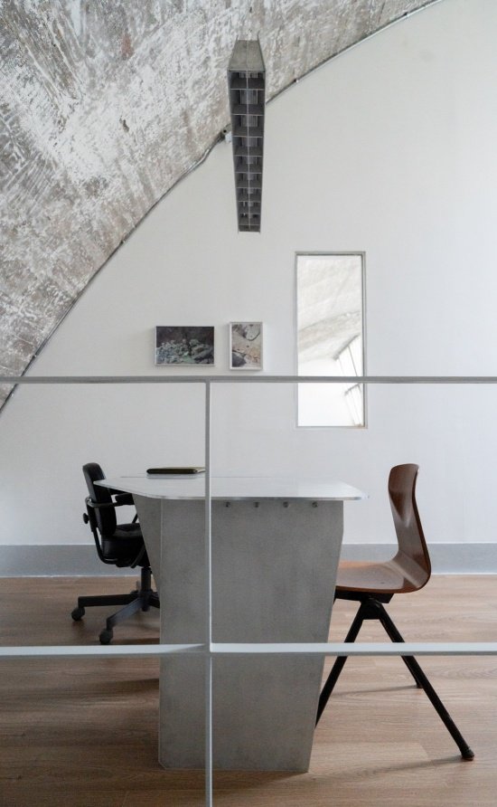
▼Looking at the aluminum alloy desk and pendant lamp, Aluminum alloy desk and pendant lamp © Chen Guanghui
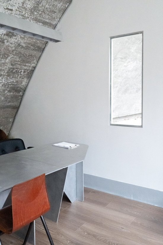
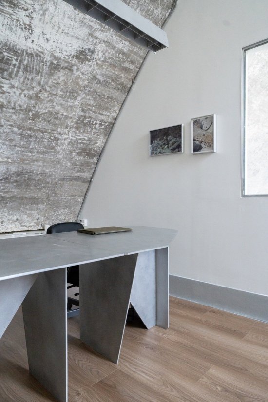
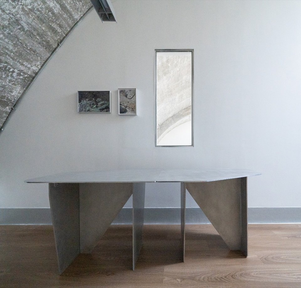
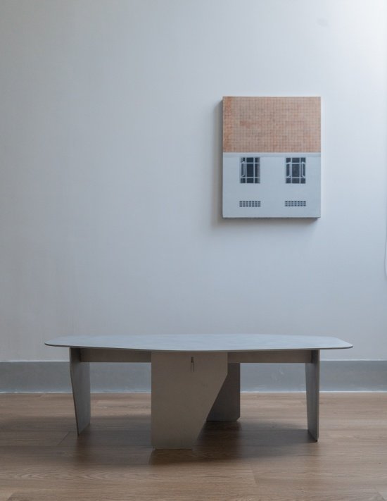
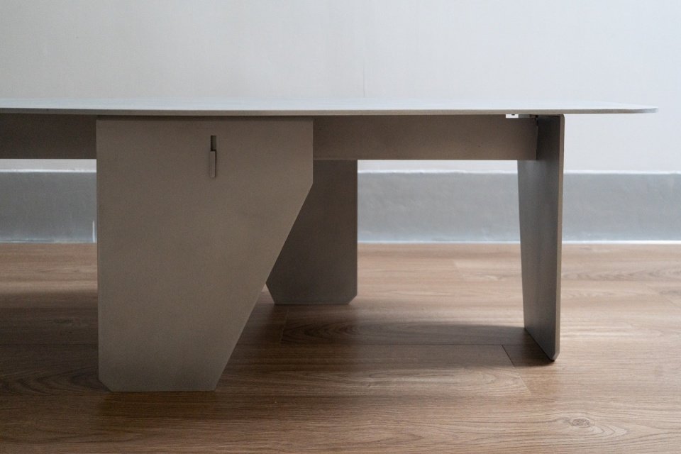
As for the movable furniture, due to the particularity of the interior space language on the second floor, it is difficult to match suitable furniture, and the manager is willing to accept compromises on comfort. Therefore, the designer designed it himself and used the color, texture and touch of aluminum plates to design several pieces of furniture with visual and functional focus – desks, chandeliers, coffee tables, and bookcases (not implemented yet) to match the atmosphere of the space and ensure the coordination of the furniture with the space atmosphere and color.
▼Furniture Design, Furniture Design © Borrowing Light Practice Architectural Design Studio

For the freestanding furniture, the distinctive spatial language of the second-floor interior made suitable pieces difficult to find, and the director was willing to accept a compromise on comfort. The designer therefore created several pieces as visual and functional focal points—a desk, a pendant lamp, a coffee table, and a bookcase (not yet realized)—using the colour, texture and feel of aluminum panels to match the space and keep color and mood harmonious.
▼The relationship between chandelier and desk, Pendant Lamp and Desk in Relation © Chen Guanghui
▼The desk’s overall form is assembled from two identical units. © Chen Guanghui
▼Aluminum alloy tabletop texture © Chen Guanghui
▼Detail of the coffee table’s construction: bolted connections allow disassembly © Chen Guanghui
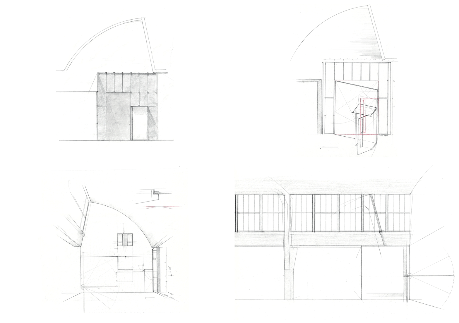
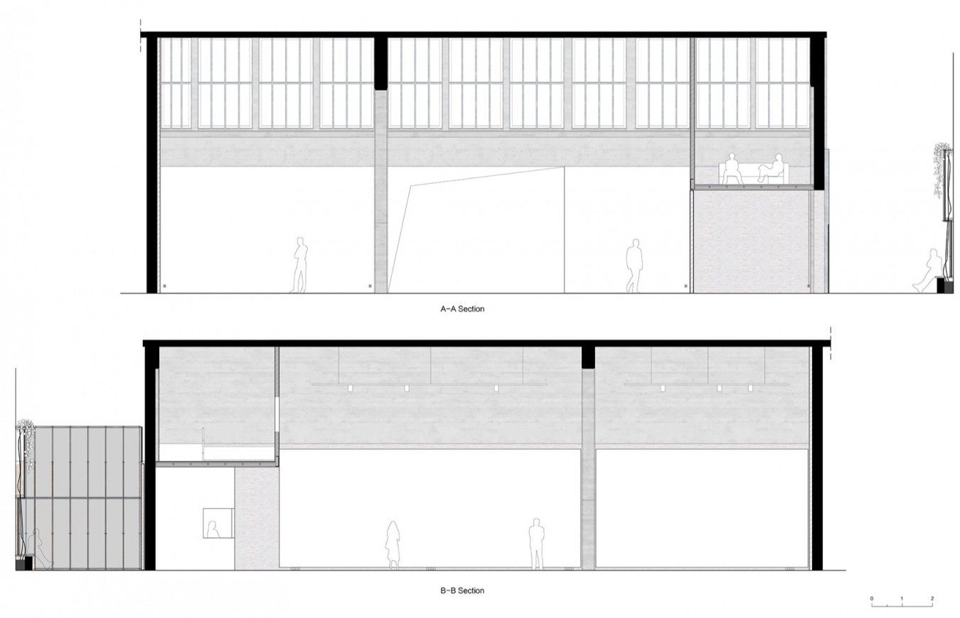
▼Cross section, Section © Borrowing Light Practice Architectural Design Studio

▼Door plan and details, Door plan and Details © Borrowing Light Practice Architectural Design Studio

Project name: REFLEXION|Space renovation design
Project type: Building facade and interior renovation design
Designer: Borrowing Light Practice Architectural Design Studio
Project Design: Chen Guanghui
Completion year: May 2024
Project address: 798 Art District, Beijing
Building area: about 270㎡
Photography copyright: Chen Guanghui, REFLEXION echo
Space exhibition consultation: Dai Xiyun
Client: REFLEXION
Contact email: info@enlightenarch.com
Website: www.enlightenarch.com
Project Name: REFLEXION | Spatial Renovation Design
Project Type: Architectural Facade & Interior Renovation Design
Design: EnlightenArch Studio
Project Designer: Chen Guanghui
Completion Date: May 2024
Location: 798 Art District, Beijing
Building Area: approx. 270 m²
Photo Credit: Guanghui Chen, REFLEXION
Space Exhibition Consultant: Xiyun Dai
Client: REFLEXION
Contact Email: info@enlightenarch.com
Website: www.enlightenarch.com
More:Borrowing Light Practice Architectural Design Studio. More about them:Borrowing Light Practice Architectural Design Studio on gooood
Source: gooood.cn