

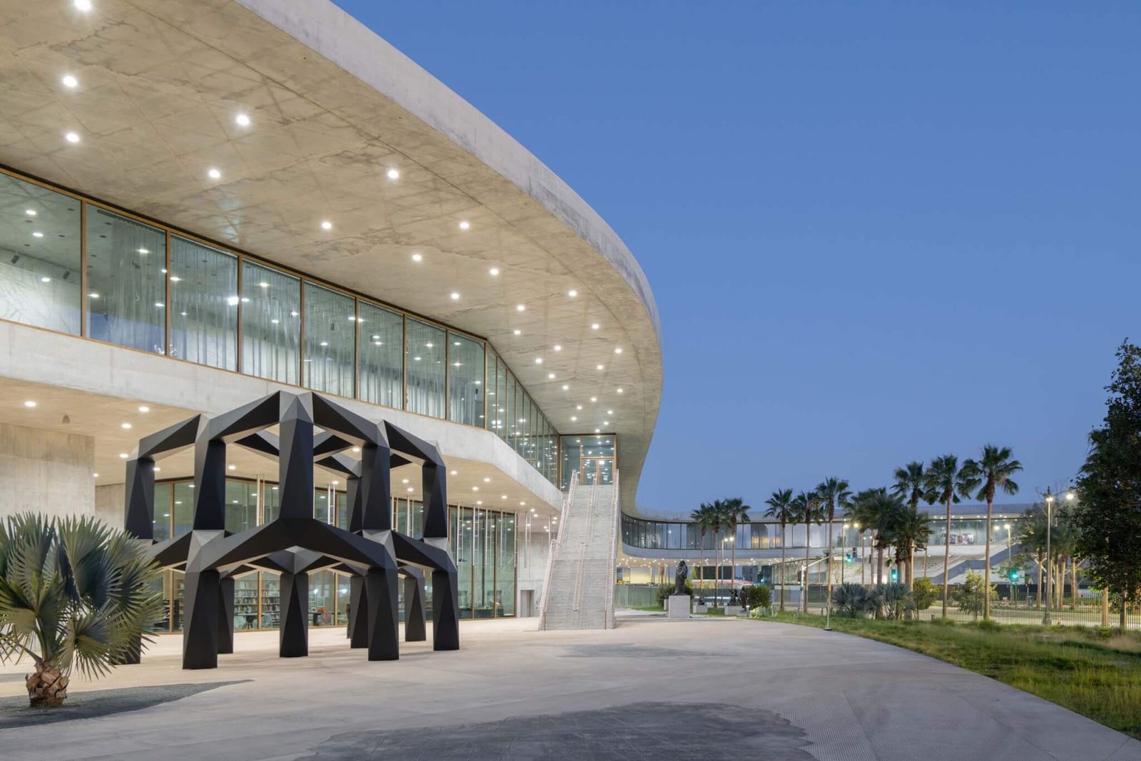
“A critic can always change her mind,” I thought to myself as I hunted for parking off Wilshire Boulevard. At a stoplight, the full flank of Los Angeles County Museum of Art’s David Geffen Galleries filled my windshield. Late afternoon sun cut sideways and glinted warmly off the large glass panes, each framed in brass. Floppy palm trees masked the hefty concrete structure as it arced over the street. Despite the hour, the constellation of fairy lights embedded in the cantilevered roof were on, twinkling. I looked up at Swiss architect Peter Zumthor’s 347,500-square-foot structure, completed in collaboration with SOM, and thought, “Hmm, not so bad.”
Many folks have remarked that the museum’s panoramic facade is cinematic and reference auteur directors. But maybe it’s a rom-com? In a Jane Austen novel, this would be the détournement—the plot twist when the protagonist’s object of derision turns to one of affection, if not desire. The Pritzker Prize–winning architect’s scheme has been my Mr. Darcy since its black flower—a tribute to a tar puddle—was first revealed in 2012. Like a true Elizabeth Bennet (or Bridget Jones), I’ve chided the museum for a lack of masterplan, called the demolition of the existing buildings cruel, and compared the environmentally tone‑deaf design to an ark, an overpass, and a bridge (to nowhere). And yet here I was taking in the view.
At his best, Zumthor is a wizard of phenomenology, as evidenced in the kindness of the spring light that relaxed the unrelenting concrete—inside and out: plazas, walls, floor slab, roof slab, all atmospherically mottled with lime stains and formwork traces. The building’s best qualities have little to do with mass or form, but with the way sunlight plays along surfaces, casting shadows and creating infinite reflections. It’s particularly seductive toward cocktail hour. Given that daylight is a liability for most museums, it’s a risk that pays off.
In a 2025 interview with LACMA CEO and Wallis Annenberg Director Michael Govan, the architect claimed his design to be an “homage to Oscar Niemeyer and all these other architects who could create massive buildings that you couldn’t do in Central Europe.” But with the edge taken off the grandeur, the David Geffen Galleries resembles a heroic corporate campus building, like a streamlined Arthur Erickson, a chunky Eero Saarinen. Or, maybe, SOM’s Weyerhaeuser Headquarters on stilts, minus the Peter Walker landscape.
Fast forward to the press preview, where the amorphously shaped edifice felt more familiar than radical. My softening to the design, however, does not make this a Brutalist meet-cute. A fundamental problem with the set-up is Govan’s longtime insistence on a single-story museum because he believed it to be more welcoming than a multilevel structure. This $724-million premise led to the decision to raise the galleries 30 feet in the air, stretch them across a public right of way to land on a property owned by the museum, and provide two steep exterior staircases (and a few discrete elevators) as access.
Set atop base isolators, this glass-and-concrete sandwich allows LACMA to display its encyclopedic collection of global art as a single, non-hierarchical presentation across 110,000 square feet of exhibition space. At the press event, journalists sipped Erewhon × LACMA branded smoothies (the trendy health-food retailer will run the new cafe) while Naima Keith, vice president of education and public programs at LACMA, described the organization as “oceans, not borders”—objects are grouped not by nation states but by watery geographies. Visitors promenade along the length of the span, drifting in and out of a maze of richly colored, tomb-like galleries. Artworks new and ancient find fresh meaning when arranged by Pacific Ocean, Indian Ocean, Mediterranean Sea, and Atlantic Ocean. Toward the south end of the gallery, for example, El Anatsui’s Fading Scroll (2007), made out of bottle caps and wrapper, is draped around a cement corner and shown with traditional African textiles and sculpture.
Yet the leap across Wilshire Boulevard alienates the structure from rest of the LACMA campus and Hancock Park. Sure, the elevation offers sweeping views of Los Angeles, but the building’s relationship to the immediate urban context remains willfully unresolved—it’s fenced off from the street, surrounded by hot concrete plazas, and disconnected from LACMA’s Resnick Pavilion and Broad Contemporary Art Museum, both designed by Renzo Piano Building Workshop. Landscape and plantings might have made the connection more synthetic, but Olin’s contribution is anemic assemblage of bioswales planted with grasses and a smattering of sage.
Lifting the galleries leaves the ground level as an open expanse, a kind of post-traumatic response to the black ooze that would occasionally invade the basement of the old buildings designed by William Pereira. At various times over the last two decades, Govan suggested that the open space around the new building would be a sculpture park. In theory, the museum made good on this promise. Tony Smith’s Smoke, a collection of Renoir bronzes, and Alexander Calder’s sculptural fountain Three Quintains (Hello Girls), were all reinstalled close to original sitings. Across Wilshire, Jeff Koons’s Split-Rocker is a planted sculpture squeezed between the museum and an adjacent office building. The plaza itself is LACMA’s largest artwork: Feathered Changes by Mariana Castillo Deball, commissioned by the museum, is a site-specific, 225,000-square-foot surface combines abstract patterns drawn into the cement with pawprints of coyotes, bears, and raccoons, like a Grauman’s Chinese Theatre for indigenous critters. (Zumthor’s—and Govan’s—footsteps are also included.)
Deball’s work, however, is already being overwritten by layers of temporary and semi-permanent usage: cafe tables and chairs, high-tops for donor cocktails, risers and podiums, a stainless steel step-and-repeat for the Vanity Fair Academy Awards afterparty. More to come: Dior’s Cruise 2027 collection will be presented here next month. On the day of the building preview, a giant party tent blocked the flow between the new building and the rest of the old campus. For LACMA, the blankness of the ground plane is a calculated VIP feature, not a bug. Zumthor’s creation will soon become a backdrop for events in a nonstop stream of brand activations.
Will Zumthor’s design allow the general public to feel caught up in these activities, like at the Centre Pompidou? Or will they be excluded from the hubbub? The hierarchies of cultural production increasingly feel out of reach. It doesn’t help that in order to enter the museum you must scale the 60-some steps to the galleries. And, one must note, that a custom Erewhon smoothie and a LACMA general admission ticket are about the same price.
The architecture is ambivalent on this issue, but it does pull back the curtain at times. From LACMA’s Welcome Plaza, it’s possible to catch a glimpse of Henri Matisse’s La Gerbe behind the glass, as the large ceramic hangs in the museum’s most airport-terminalesque northwest end of Zumthor’s oven mitt.
Stuffed with visitor-oriented programs, seven “pavilions” support the galleries, like the sturdy legs of a great beast. The Keck Education Center and Erewhon are tucked beneath the building’s most overpass-like section and have brass-framed glass facades on two sides that look out onto Wilshire Boulevard and Bruce Goff’s Japanese Pavilion. On the opposite side of the museum, a glazed-front restaurant and bookstore face southwest. To mitigate the direct sun, a series of large, metallic louvered sunscreens are suspended from the concrete deck above. They are functional but weird, like clip-on sunglasses. Their performance-centric expression seems to bear the traces of SOM’s hand in realizing the project.
My Détournement
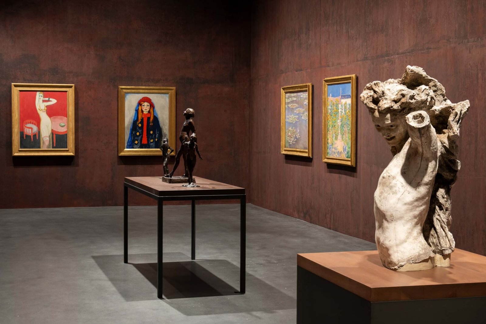
So, where is the love, you might ask? It’s upstairs, in the labor of LACMA’s 45 curators who were patient enough to figure out how to work within the architect’s at times confounding gallery plan. The brainchild of both Zumthor and Govan, the David Geffen Galleries propose a challenging new typology: encyclopedic museum as kunsthalle. What that means in practice is a permanent collection of artworks and artifacts in rotation (every six months or so), with 6,000 years of culturally specific pieces in dialogue. Ancient artifacts mingle with contemporary works.
The galleries are light on didactics. During press remarks, both Govan and Keith noted that the goal was to let the artworks speak for themselves and to encourage visitors invent their own story—one of migration and interconnectedness. The museum leans into the word “wander,” going so far as use it as the title of its $14.95 program guide.
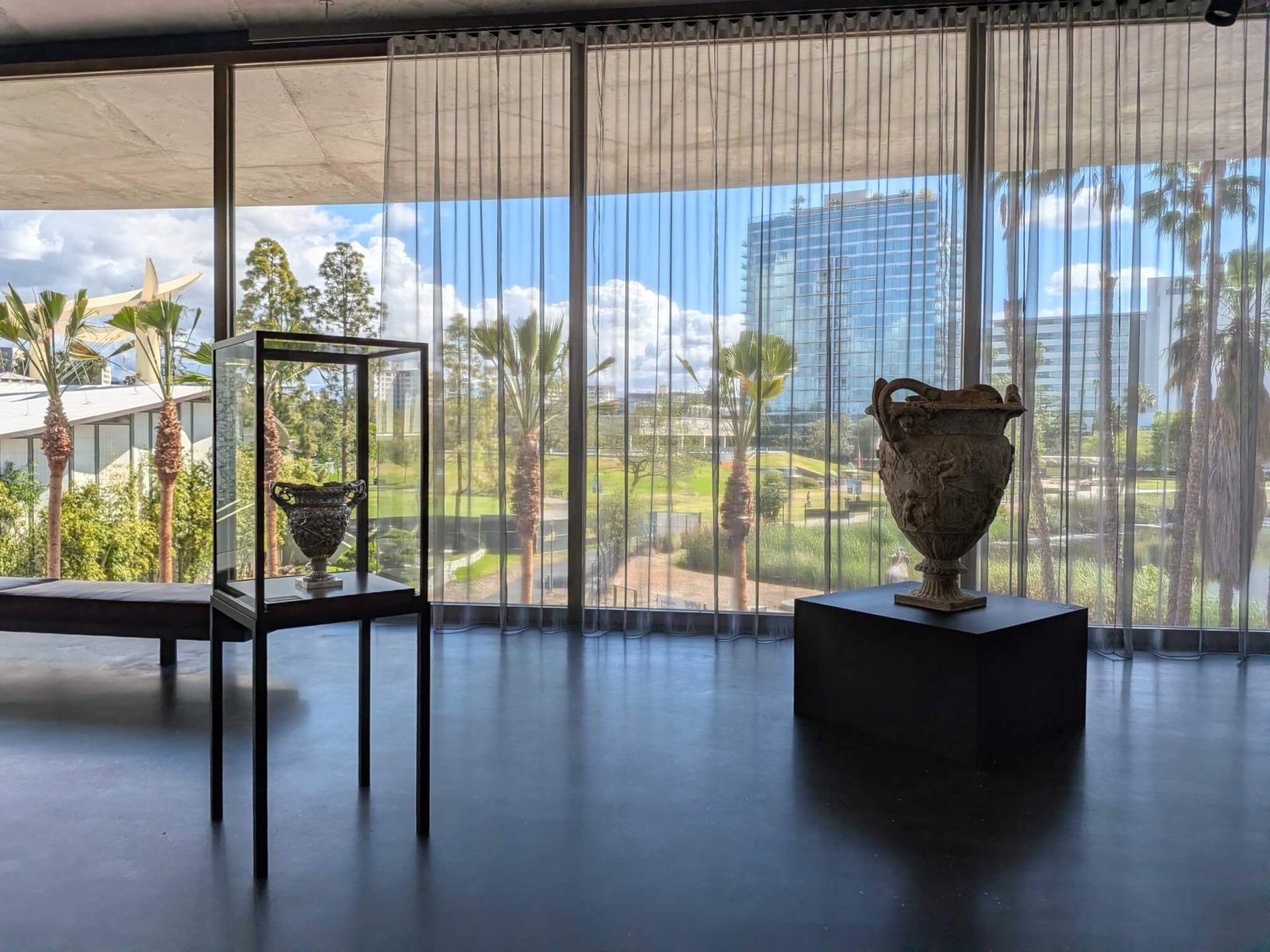
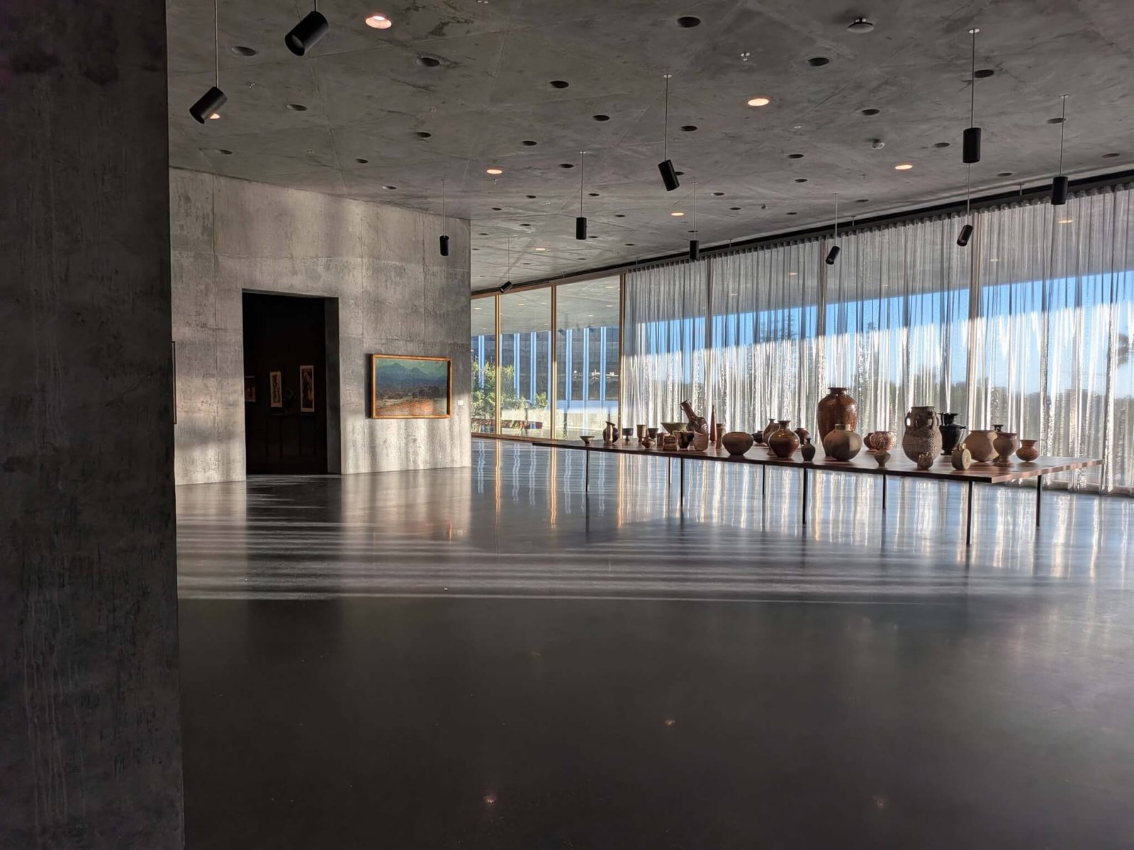
Hats off, then, to the curator who chose Liz Glynn’s The Futility of Conquest (Cavalcade) (2023) to greet visitors. A wry commentary on colonization in a museum that is working hard to present a post-colonial narrative, the sculpture depicts the rear ends of three horses. It tells us that history is turned ass-backwards while also suggesting a way to orient yourself in the museum—every direction is all directions and no direction, at once. Faced with gray wall after gray wall, you glance out the panoramic windows at Los Angeles to get your bearings. Custom organza and chrome curtains by Japanese textile artist Reiko Sudõ, however, shroud the glass along all parts of the window wall, washing the view with a homey haze.
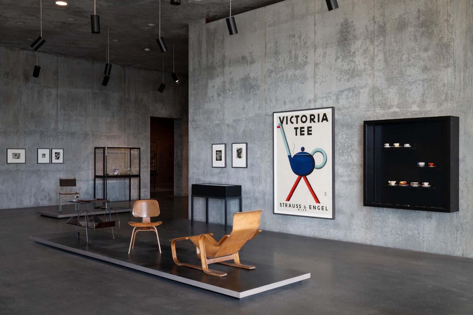
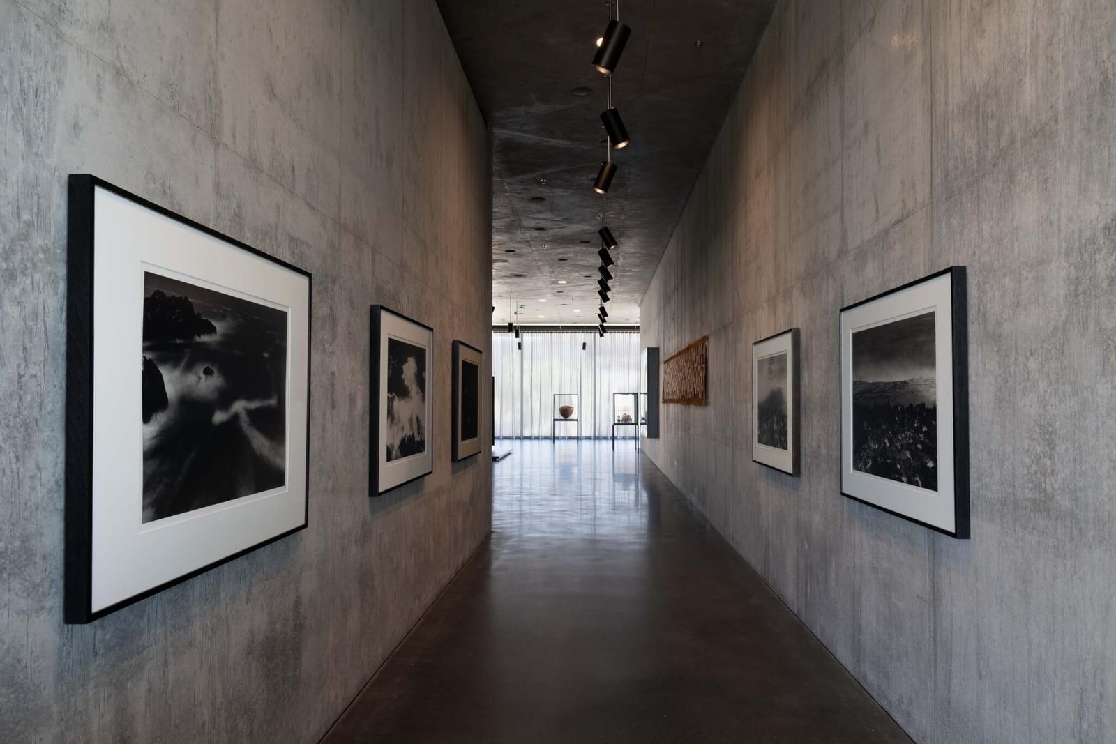
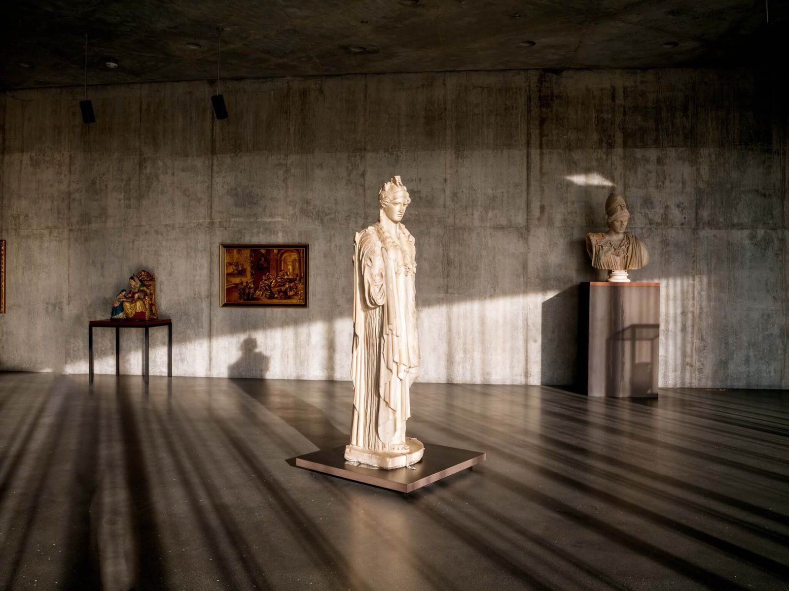
The building has two categories of exhibition space on offer: daylit concourse and dim box. Rectangular galleries scattered across the oozing plan are more traditional, but even when the concrete is tinted blue, maroon, or charcoal, they feel weighty and airless. Proper clerestories were value engineered out of the final design, but in a few cases a narrow gap was left between the wall and ceiling, allowing slivers of daylight to wash the colored surfaces.
Everywhere else is exhibition concourse—expanses that run the perimeter of the building and ooze between the contained rooms. Frank Gehry had a habit of grouping cubic forms around an open atrium a la a Tuscan piazza. Here, Zumthor’s treatment is more suburb than village, a calibrated sprawl. A wildly broad range of non–light sensitive objects dot these areas, from Roman marble sculpture from to avant-garde Korean ceramics. Exhibition furniture designed by Zumthor and fabricated by MASH STUDIOS, especially when considered with the curtains, domesticate the interior in ways that are sweet and other times cluttered. A long steel and wood table, for example, is set with antique vessels, allowing close inspection. But the arrangement also resembles a high-end display in a housewares store, which invites touch—a gallery guard’s nightmare.
In Clueless, one of L.A.’s best romantic comedies, Cher Horowitz describes a “Monet”: “It’s like a painting, see? From far away, it’s okay, but up close, it’s a big old mess.” Similarly, Zumthor’s building neither fully seduces nor entirely repels. It’s both brutal and impressionistic, with architectural moments that rely on a Hollywood romance toolkit: Golden Hour light and curated perception.
Mimi Zeiger is a Los Angeles–based critic and curator.