

grateful External Reference Share the following content with gooood. More about:External Reference on gooood.
Appreciation towards External Reference for providing the following description. More: External Reference on gooood.
October 2026, Barcelona. External Reference presents Sando’s new flagship restaurant at Niederdorfstrasse 60 in Zurich. The project created the brand’s visual identity and interior design from scratch. The burger chain combines American cuisine with Japanese culinary traditions, and the design translates this gastronomic fusion into a dialogue between the languages, materials and architectural references of the two cultures across 220 square meters of space.
Barcelona. October 2026. External Reference presents Sando’s new flagship restaurant in Zurich, at Niederdorfstrasse 60. The project develops the visual identity and interior design of the brand from scratch. A burger chain that combines American cuisine with Japanese culinary tradition, it translates this culinary fusion into a dialogue between the languages, materials and architectural references of both cultures across a 220 m² space.
▼The restaurant seen from the street © Marek Jarosz
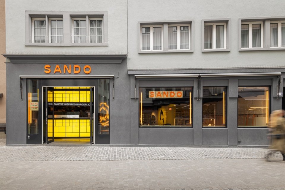
▼Front facade and entrance of the restaurant © Marek Jarosz
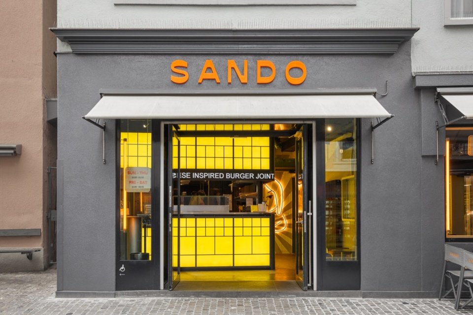
The brand’s iconic yellow color has been deconstructed and translated into architectural and spatial elements; the logo is no longer just a graphic symbol, but a three-dimensional presence that occupies, connects and “colonizes” various areas of the site. Graffiti-style graphic interventions on the walls and floors complete the visual identity throughout the space.
The yellow that characterizes the brand is deconstructed and translated into architectural and spatial elements; the logo ceases to be a mere graphic element and becomes a three-dimensional presence that occupies, connects and colonizes the different areas of the venue. Graffiti-style graphic interventions on walls and floors complete a visual identity that runs through the entire space.
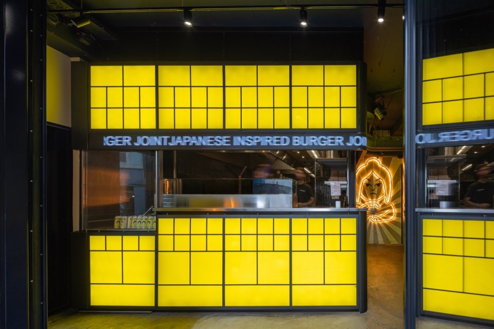
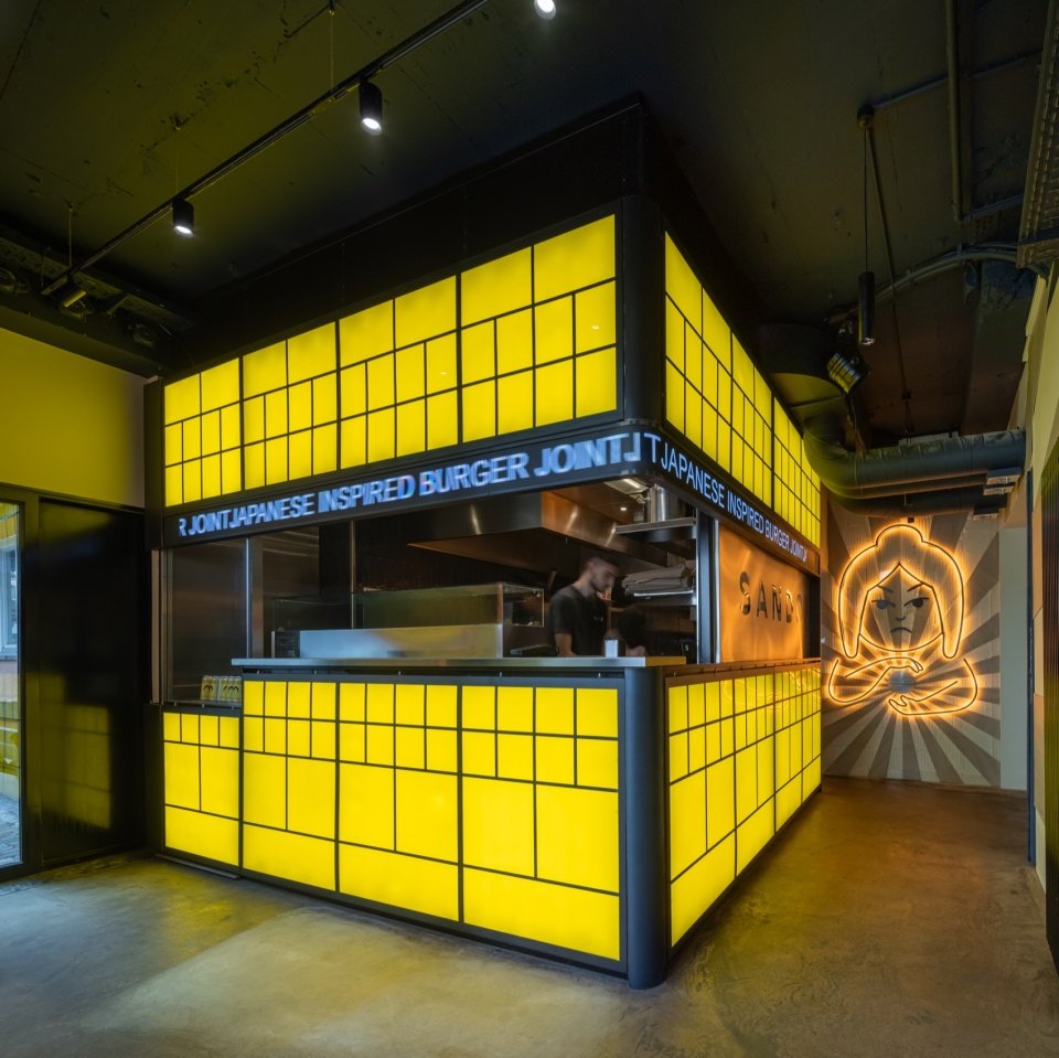
▼The entrance counter © Marek Jarosz
“Sando is a project that plays with Japanese images, street culture and burgers, and has almost become a pop icon in the food world,” explained Carmelo Zappulla, founder and lead architect of External Reference. “We wanted a young, casual, slightly ‘innocent’ atmosphere, with a bit of simple Japanese temperament.”
“Sando is a project that plays with Japanese iconography, street culture and the burger, to the point of becoming almost a pop icon of gastronomy —explains architect Carmelo Zappulla, founder and director of External Reference— We wanted a young, laid-back, slightly ‘naïve’ atmosphere, with an ingenuous, Japanese touch.”
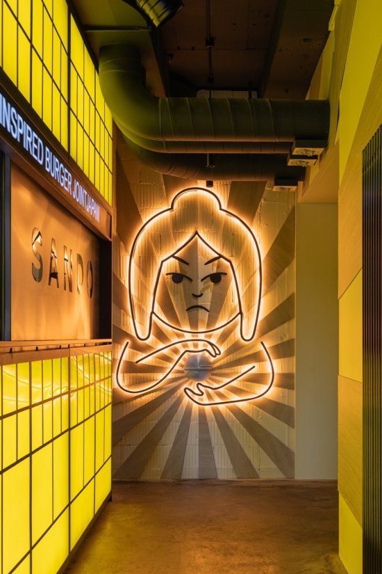
▼Neon brand mascot and yellow light box wall,
The neon brand mascot against the yellow lightbox wall © Marek Jarosz
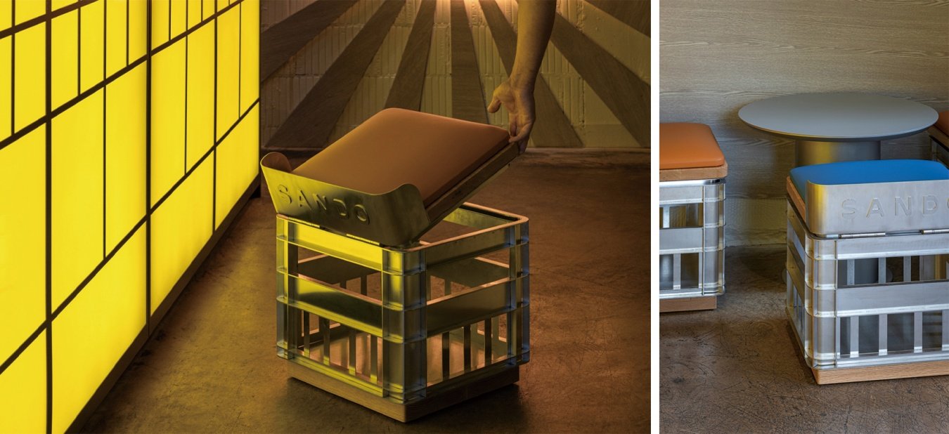
▼Storable seat © Marek Jarosz
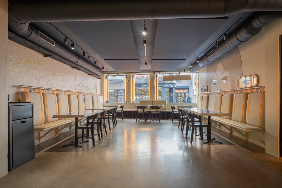
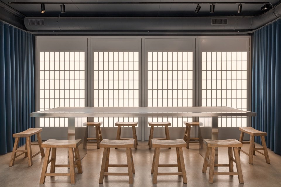
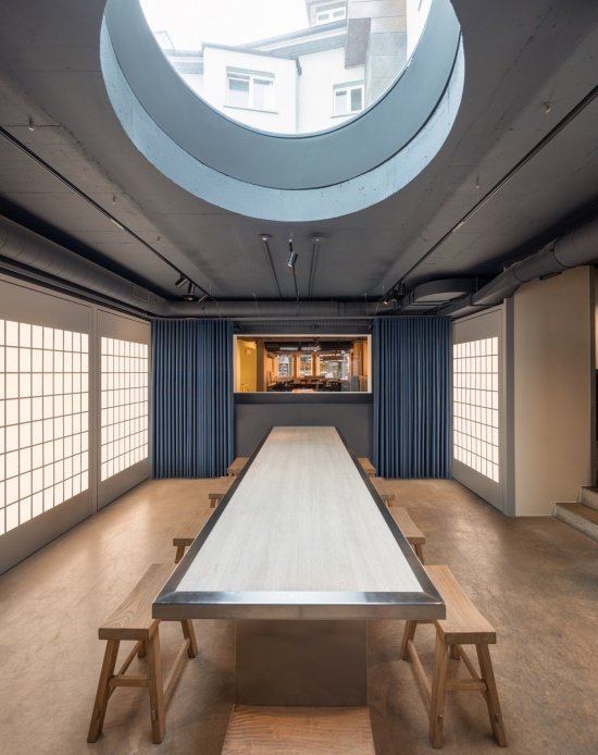
The project incorporates the inherent practice of Pop Art: taking the brand’s everyday elements—packaging, shipping boxes, and visual symbols—and giving them new dimensions and functions. They are no longer images to be attached, but gain volume and purpose, becoming part of the architecture and furniture of the site. The experience unfolds across three main areas. It starts with the counter next to the entrance, conceived as the central element of the site: its form reinterprets the aesthetics of Japanese street food stalls – light structures and regular patterns – and combines materials typical of industrial aesthetics – exposed black iron, yellow light boxes and a continuous strip of low-resolution LED screens, the latter a deliberate choice to strengthen the connection with the industrial imagination. From here, visitors enter the main dining room and eventually lead to a private banquet room, where traditional Japanese sliding doors – shoji – made of translucent paper and wood, are also reinterpreted with industrial materials and details.
The project incorporates a practice inherent to Pop Art: taking everyday elements of the brand —the packaging, the transport crates, its visual codes— and bringing them to a new scale and function. They cease to be applied images, gaining volume and use, and become part of the venue’s architecture and furniture. The experience unfolds across three main areas. It begins at the counter by the entrance, conceived as the central element of the venue: its form reinterprets the aesthetics of Japanese street food stalls, with lightweight structures and regular patterns, combined from here, visitors enter the main dining room, which finally leads to a private events room, where the shoji, traditional Japanese sliding doors made of translucent paper and wood, are also reinterpreted with industrial materials and details.
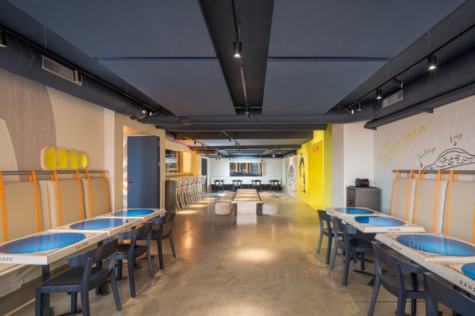
▼Overview of the dining room © Marek Jarosz
▼The private events room © Marek Jarosz
▼Long table and circular skylight in the private banquet hall,
The long table and circular skylight of the private room © Marek Jarosz
▼High table with wooden stools detail, High table with wooden stools detail © Marek Jarosz
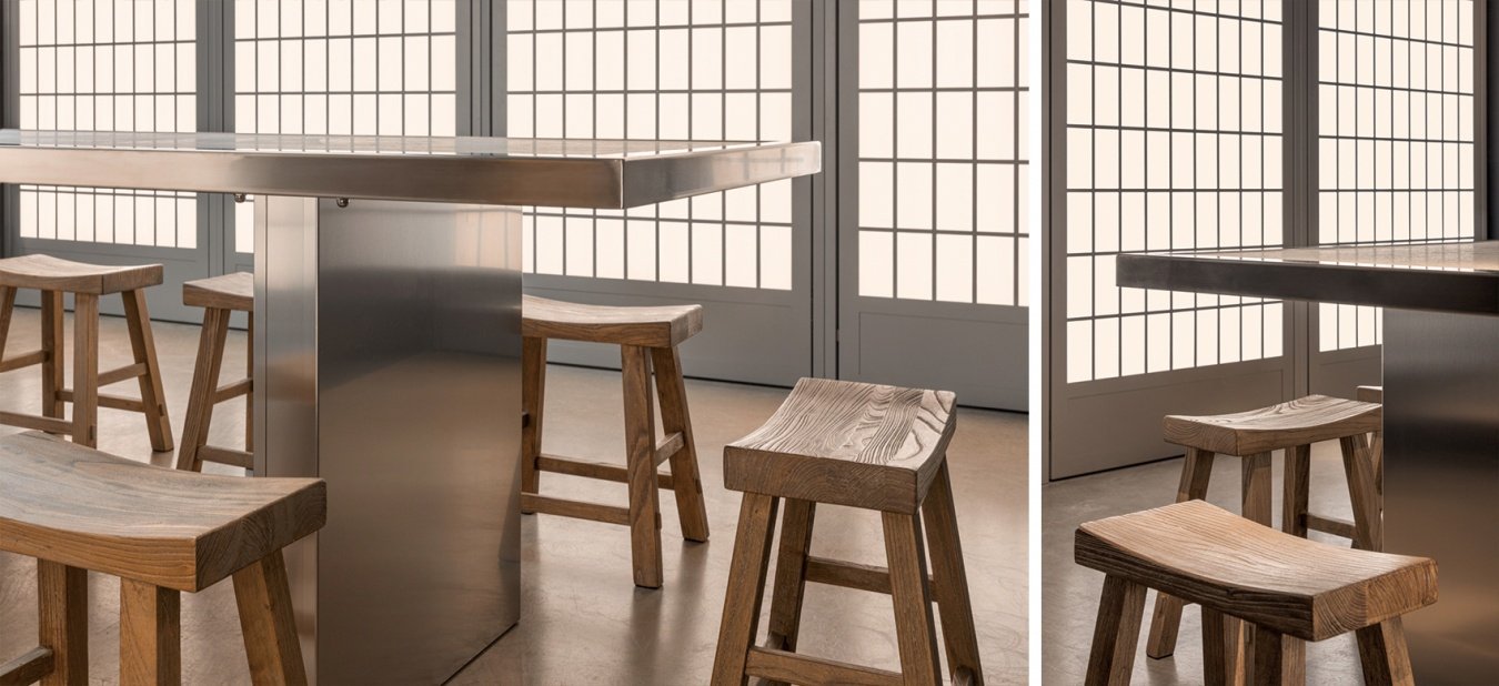
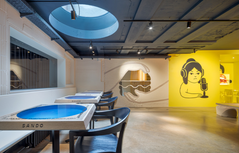
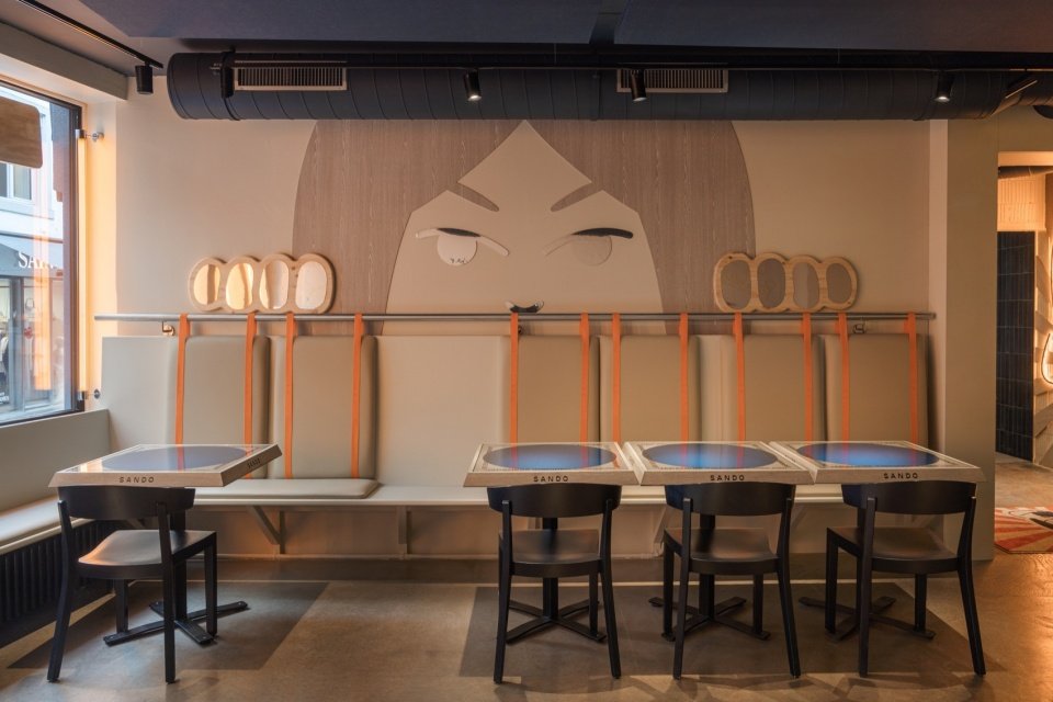
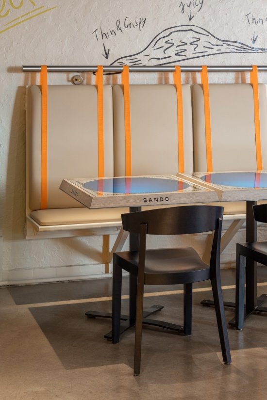
The furniture designed by External Reference continues the same principle of hybridization on a detailed scale. The dining table is inspired by Sando’s packaging: a circle milled out of wood, lined with stainless steel and closed by glass with blue foil. High tables and low, seat-inspired tables combine Japanese minimalism with the presence of industrial stainless steel. The stainless steel seats are also derived from a specific reference: the brand’s own plastic beer crates – treated as ready-mades, a ready-made object that retains its original identity. With new coverings, upholstery on the wooden base, and a hidden hinge that opens the seat to stow bags inside, they cease to be logistical devices and become functional seats. Bar stools and chairs are selected finished furniture.
The furniture designed by External Reference develops the same principle of hybridisation, but at the scale of detail. The dining tables are inspired by Sando’s packaging: a circle milled in wood, with a stainless steel interior, closed by glass with blue vinyl. The high tables and the low, zatsuzaku-inspired low tables combine Japanese minimalism with the presence of industrial stainless steel. The seats, in stainless steel, also stem from a specific reference: the plastic beer crates —which the brand produces itself—, treated as a ready-made, an existing object that retains its original identity. With a new covering, padding on a wooden base and a concealed hinge that allows the seat to be lifted and a bag to be stored inside, they cease to be a logistical element and become a functional seat. The stools and chairs, for their part, are selected furniture pieces.
▼Graffiti wall and dining tables, Graffiti wall and dining tables © Marek Jarosz
▼ Dining table and chair detail, Dining table and chair detail © Marek Jarosz
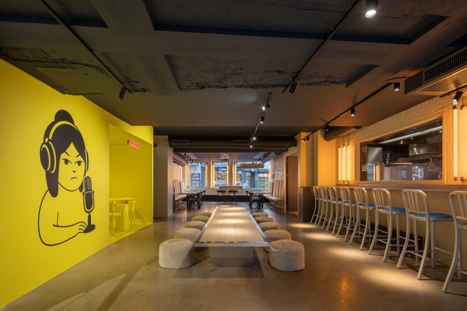
A podcast area, also marked with Sando’s yellow logo, completes the entire space. It was conceived as a hybrid area that can be used to record content for social media or as a shared table for customers to dine and take photos.
A podcast area, is also identified by Sando’s yellow, and completes the space. Conceived as a hybrid area, it allows content to be recorded for social media and works as a shared table where customers can eat and take photos.
▼Podcast area © Marek Jarosz
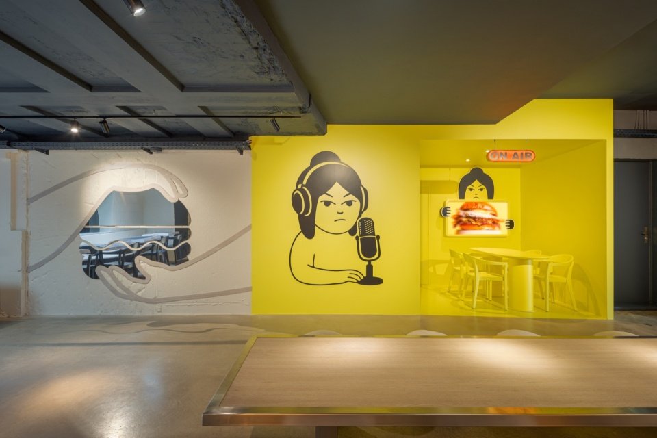
▼Dining area beside the podcast area © Marek Jarosz
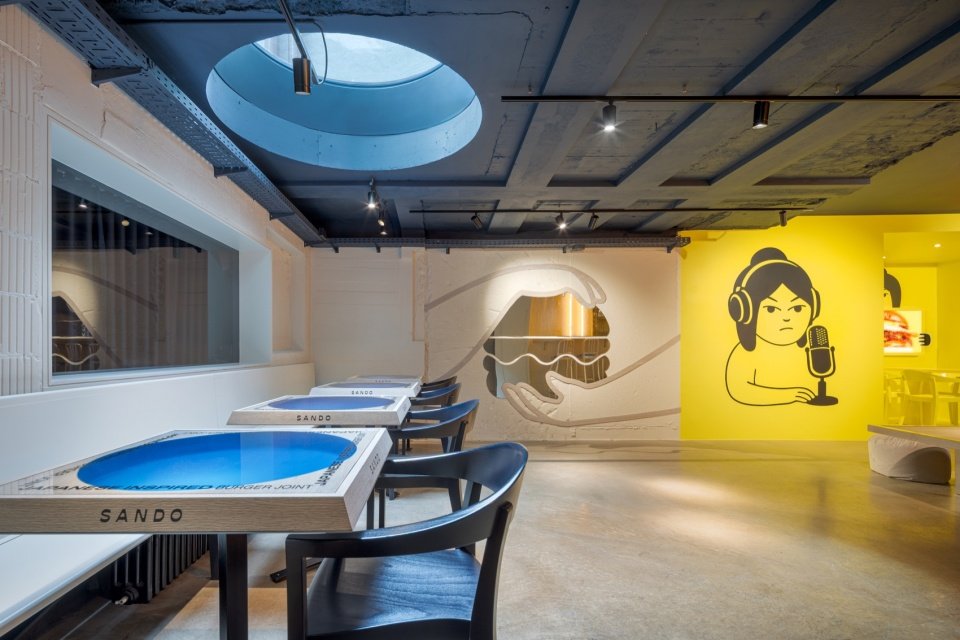
▼Dining area close view © Marek Jarosz
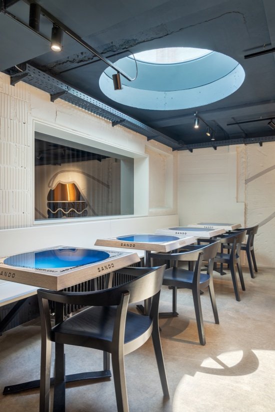
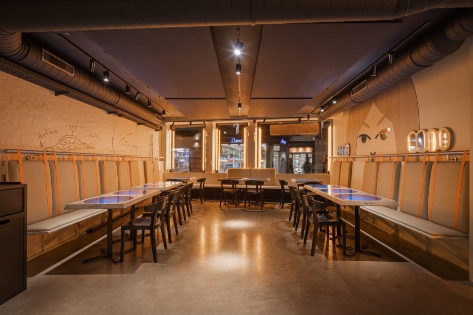
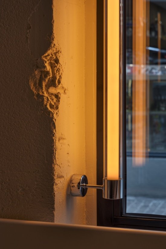
The material tone combines stainless steel, black iron, wood and yellow light boxes, with orange neon strips running through the space, creating a warm, nocturnal and underground atmosphere, forming an informal counterpoint to the rigor of Japanese geometry. Sando’s new flagship restaurant in Zurich thus synthesizes two cultural aesthetics – Japanese minimalism and the industrial aesthetic of American street food – into a coherent language that runs through architecture, interior design and visual communication, transforming the venue into a recognizable experience for the brand’s audience. Yellow, logo and packaging shape also work together to construct a recognizable spatial identity. Pop references exist both in the image of the site and in the objects that make up it.
The material palette combines stainless steel, black iron, wood and a yellow lightbox, with orange neon lights running through the space to create a warm, nocturnal and underground atmosphere, an informal counterpoint to the rigour of Japanese geometries. Sando’s new flagship in Zurich thus synthesizes two restaurant cultural aesthetics —Japanese minimalism and the industrial aesthetic of American street food— into a coherent language spanning architecture, interior design and visual communication, transforming the venue into a recognisable experience for the brand’s audience. The color yellow, the logo and the packaging shapes also build a recognisable spatial identity in which the pop reference is present both in the image of the venue and in the objects that compose it.
▼Restaurant interior night view © Marek Jarosz
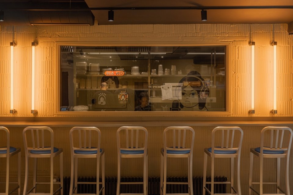
▼Detail of the wall lamp, Detail of the wall lamp © Marek Jarosz
Project name: Sando restaurant flagship store
Design: External Reference
Founder/Lead Architect: Carmelo Zappulla
Location: Niederdorfstrasse 60, Zurich, Switzerland
Area: 220 m²
Year: 2026
Furniture and fabrication: Metalcor
Lighting (orange light): Comled
Photography: Marek Jarosz
Website: externalreference.com
Email: press@laboh.net
Project name: Sando’s new flagship restaurant
Design: External Reference
Founder & director: Carmelo Zappulla
Location: Niederdorfstrasse 60, Zurich, Switzerland
Area: 220 m²
Year: 2026
Furniture and fabrication: Metalcor
Lighting (orange lights): Comled
Photography: Marek Jarosz
Website: externalreference.com
Email: press@laboh.net
More:External Reference,External Reference on gooood
Source: gooood.cn