


















grateful ARCHWASTE(Contact email: archwaste@163.com) Share the following content with gooood. For more information about them, please go to:ARCHWASTE on gooood
Appreciation towards ARCHWASTE (contact: archwaste@163.com) for providing the following description:
Project introduction
Project Description
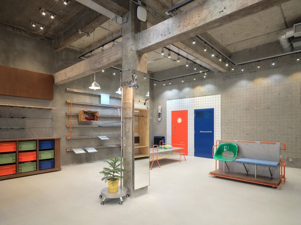
TYAKASHA is a designer brand founded in Shanghai in 2007. It aspires to chase dreams, be brave, love and enjoy life like a pirate. As the brand’s first offline flagship store, TYAKASHA GALLERY is both its own “art gallery” and a functional “grocery store”, and regularly organizes workshops. ARCHWASTE hopes to highlight the playful elements and handmade features of the brand culture, combined with Gallery’s sense of critical conflict, to create a warm, free and unique space like a street artist’s studio.
TYAKASHA is a designer brand founded in Shanghai in 2007. Inspired by the spirit of pirates, the brand embraces the pursuit of dreams, courage, love, and the enjoyment of life. As TYAKASHA’s first offline flagship store, TYAKASHA GALLERY serves both as the brand’s own “gallery” and as a multifunctional “general store”, while also regularly hosting workshops. In the design, ARCHWASTE sought to highlight the playful and handcrafted qualities of the brand while introducing the sense of contrast and tension associated with a gallery, creating a space that feels warm and free like a street artist’s studio, yet maintains its own distinctive character.
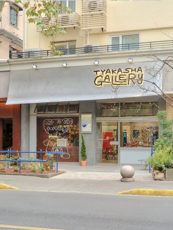
▼Storefront along Yuyuan Road © Dai Cheng/Dai Cheng
▼Storefront facade and courtyard © Dai Cheng/Dai Cheng
▼Storefront facade at night © Dai Cheng/Dai Cheng
▼Store entrance viewed from the street © Dai Cheng/Dai Cheng
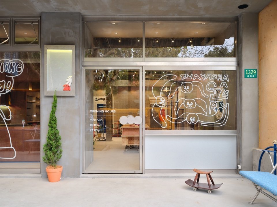
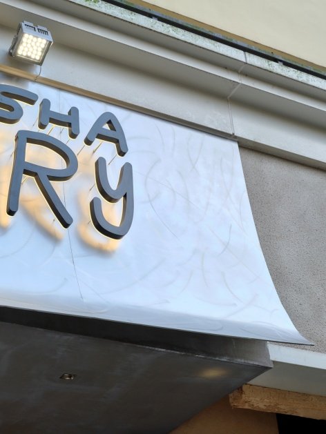
We use the blue railings in the courtyard to guide pedestrians’ sight to the entrance and display windows. As the visual focus, the door head draws inspiration from the “drawing paper” that is indispensable in the brand’s daily life, transforming it into an irregularly curled stainless steel plate, and forming a unique pattern through unconventional polishing and scratching processes, which continues the relaxed atmosphere of the brand while conveying the sense of conflict that Gallery has.
Blue railings in the courtyard naturally guide pedestrians’ views toward the entrance and display windows. As the visual focus of the storefront, the facade draws inspiration from “drawing paper”, an indispensable part of the brand’s everyday creative practice. This idea is translated into an irregularly curled stainless-steel sheet, whose surface is treated through unconventional grinding and scratching techniques to create a distinctive texture. The intervention retains TYAKASHA’s relaxed atmosphere while introducing the visual tension associated with the Gallery.
▼Entrance and display windows viewed from the courtyard © Dai Cheng/Dai Cheng
▼Brand lettering, blue railings and entrance planting © Dai Cheng/Dai Cheng
▼Brand impression in the concrete courtyard surface © Dai Cheng/Dai Cheng
▼Solid glass globe lights in the courtyard © Dai Cheng/Dai Cheng
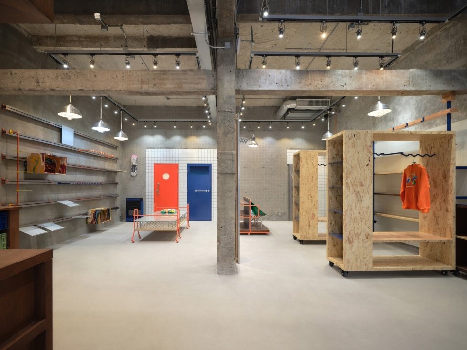
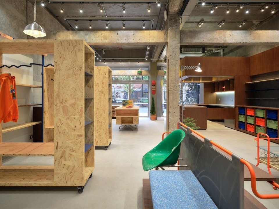
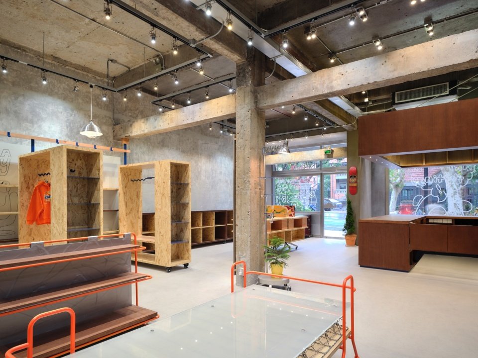
The interior is divided into workshop and retail areas through the cash register block. We knocked out some of the tiles on the end wall, retaining the original traces of peeling. The prop design intentionally breaks away from the “comfort principle” of retail space and displays them at different heights to enrich the level and interest of exploration.
Inside, a checkout volume divides the workshop and retail areas. Sections of tile on the rear wall were removed, leaving the traces of demolition exposed. The display design deliberately moves away from the conventional “comfort principles” of retail spaces, placing products at different heights to create varied layers of exploration and playfulness.
▼Overall view of the retail area © Dai Cheng/Dai Cheng
▼Column grid and multi-level display, Display layers arranged around the columns © Dai Cheng/Dai Cheng
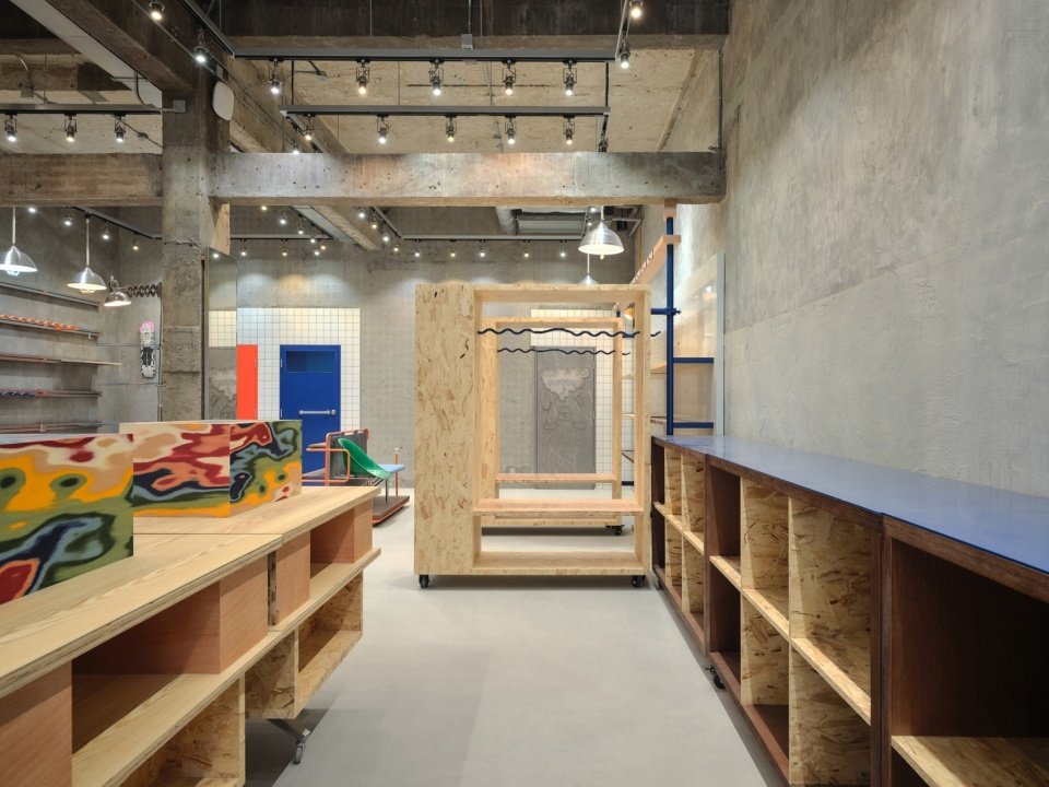
▼Workshop and movable display cabinets, Workshop and movable display cabinets © Dai Cheng/Dai Cheng
▼Workshop activity and blackboard wall, Workshop activity and blackboard wall © Dai Cheng/Dai Cheng
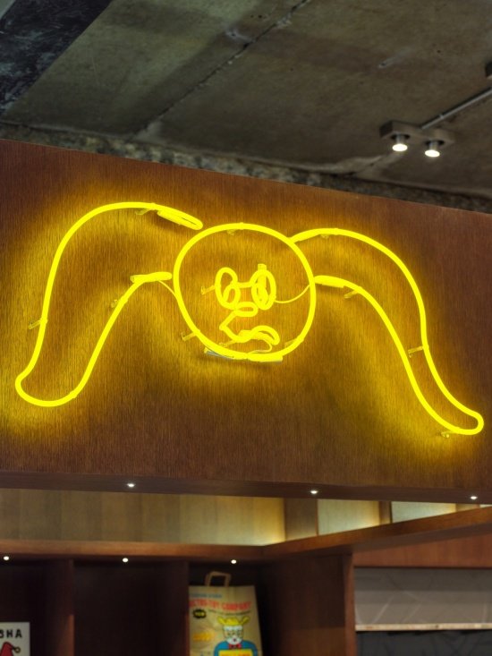
▼Checkout counter with a neon-tube logo, Checkout counter with a neon-tube logo © Dai Cheng/Dai Cheng
▼Display table and corridor towards the courtyard, Display table and corridor towards the courtyard © Dai Cheng/Dai Cheng
▼Rotating cabinets and product displays © Dai Cheng/Dai Cheng
▼View from the entrance through open displays © Dai Cheng/Dai Cheng
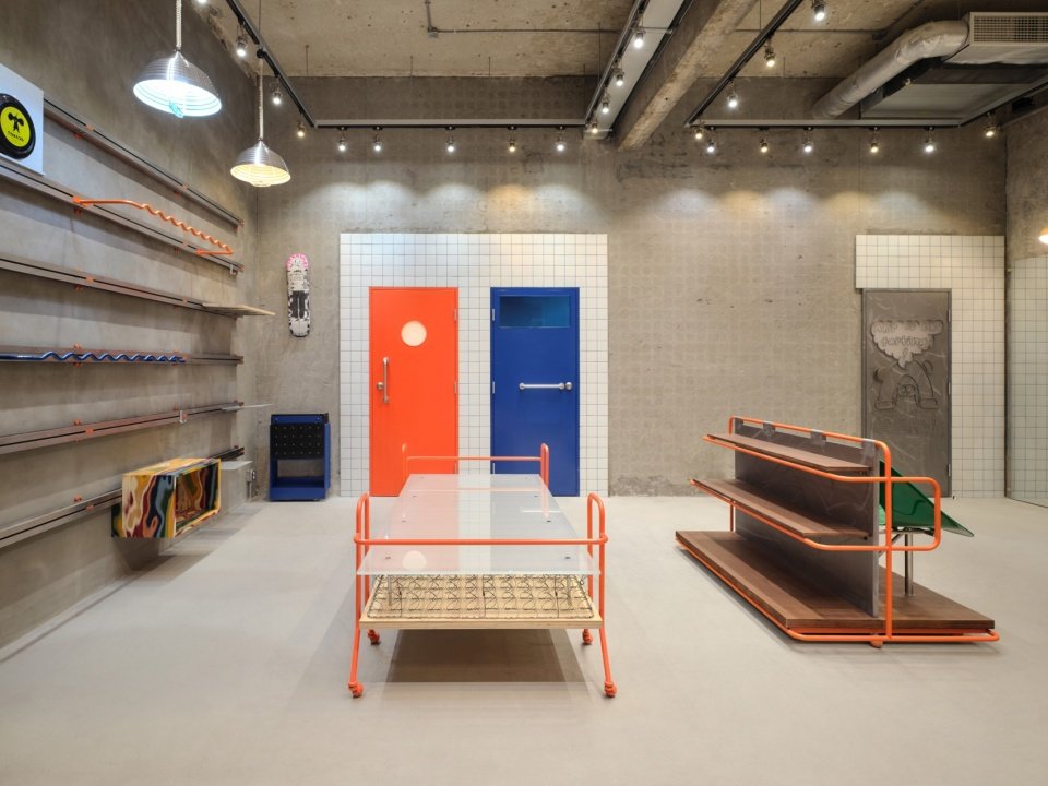
▼Wall displays and fitting-area entrance, Wall displays and fitting-area entrance © Dai Cheng/Dai Cheng
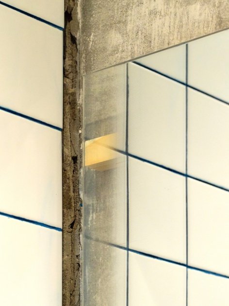
The materials are of conventional categories, and are given a hand-made texture and visual conflict through unconventional processing: wood collage forms the Workshop table and turntable; the mirror connectors are gradually revealed at the edges; the checkout counter logo uses neon tubes. An old-fashioned “announcement box” is set up in the middle of the facade, retaining the traditional use of magnetic posters; the new brand image is hand-made into fitting room seats.
Conventional materials are transformed through unconventional fabrication methods to introduce handcrafted textures and visual contrasts. Timber pieces are collaged to form the workshop table and rotating cabinets; the connections between mirrors and walls are gradually exposed along their edges; and the logo at the checkout counter is made from neon tubing. A vintage-style notice board is installed on a column along the middle section of the facade, retaining the traditional use of magnetic posters, while the brand’s new character is handcrafted into a seat for the fitting room.
▼Details of the neon tube sign at the checkout counter,
Neon-tube logo detail at the checkout © Dai Cheng/Dai Cheng
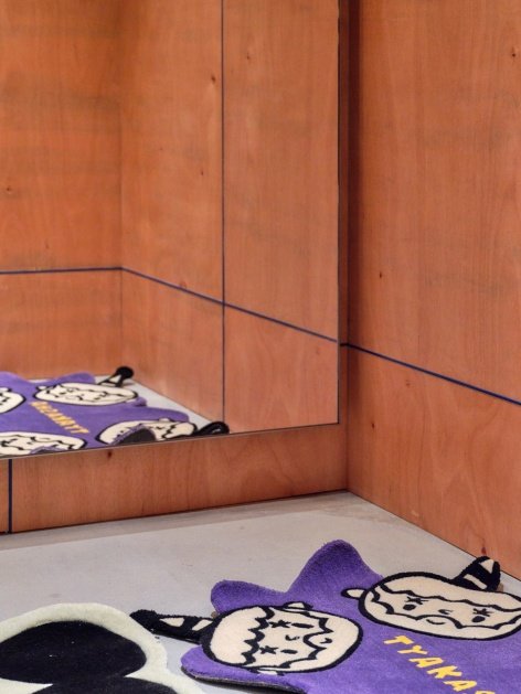
▼Mirror connectors and hand-painted surfaces, Mirror connectors and hand-painted surfaces © Dai Cheng/Dai Cheng
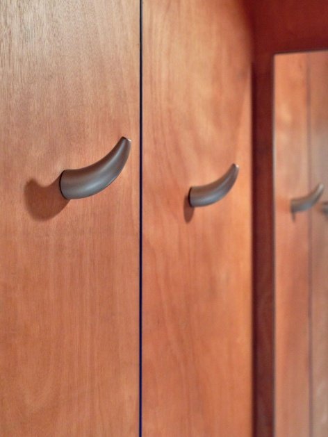
▼Timber handles and fitting-room interior, Timber handles and fitting-room interior © Dai Cheng/Dai Cheng
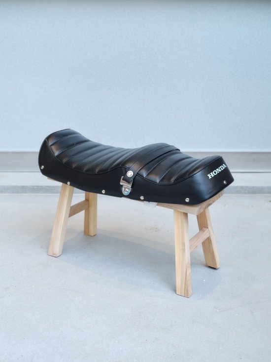
▼The fitting room seats with brand image transformation,
Fitting-room seat handcrafted from the brand character © Dai Cheng/Dai Cheng
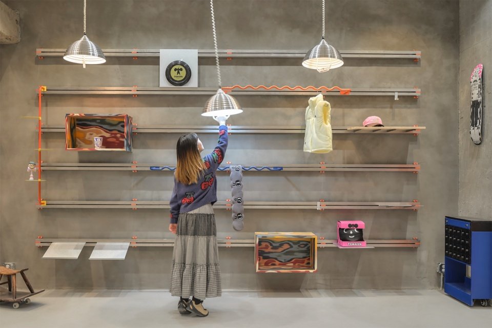
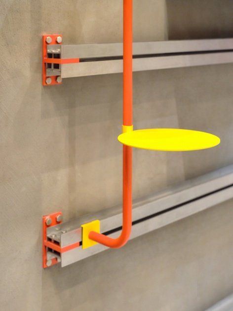
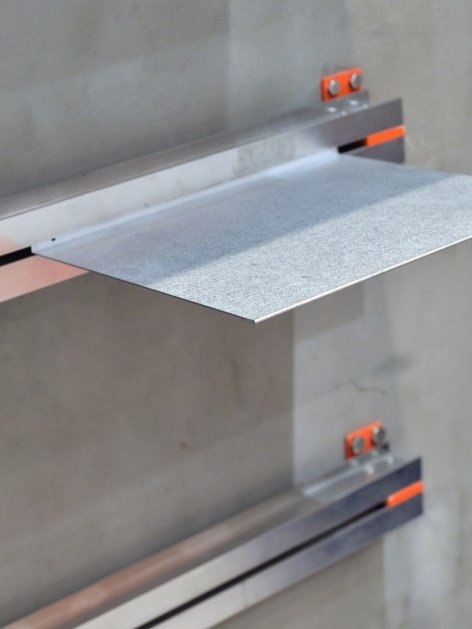
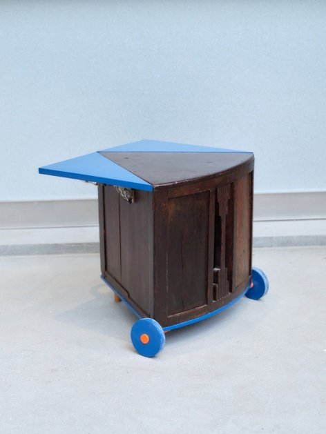
The display system on the left uses five sets of parallel I-beams as the skeleton, and uses folding plate logic to extend functional parts suitable for products of different sizes, all of which can be quickly disassembled, assembled and adjusted. The turning cabinet on the right can be rotated along the rod or moved to the center to serve as an island; after being moved, the wall becomes a complete “blackboard” for use during Workshop activities.
The display system on the left is structured around five parallel I-beams, with folded-plate components extending from the framework to accommodate products of different sizes. Each component can be quickly dismantled, repositioned, and adjusted. On the right, rotating cabinets can pivot around vertical rods or be moved into the center of the space to function as display islands. Once moved away, the wall behind them is revealed as a complete “blackboard” for use during workshops.
▼I-beam display system and folded-plate components, I-beam display system and folded-plate components © Dai Cheng/Dai Cheng
▼Demountable display connector details, Demountable display connector details © Dai Cheng/Dai Cheng
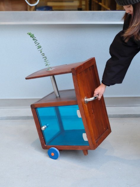
▼Wheeled rotating cabinet and side view, Wheeled rotating cabinet and side view © Dai Cheng/Dai Cheng
▼Cabinet dividers and Chinese medicine drawers © Dai Cheng/Dai Cheng
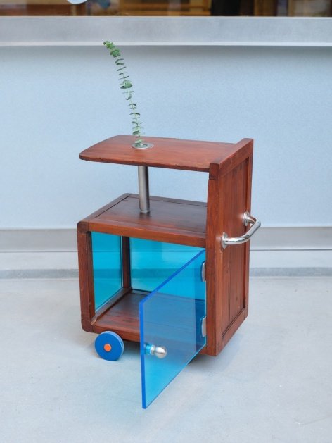
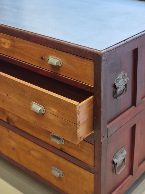
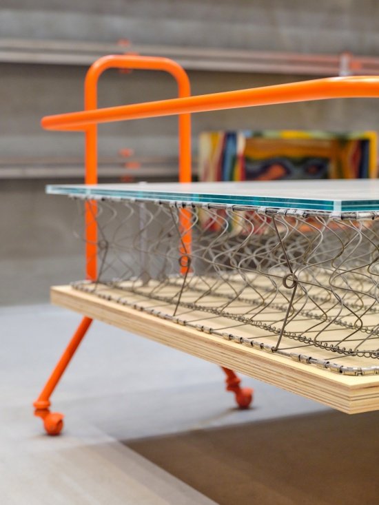
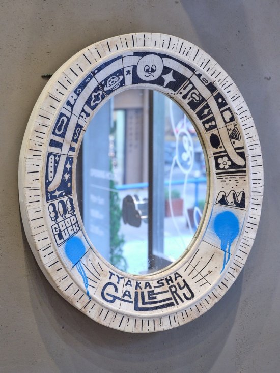
ARCHWASTE also transformed the second-hand furniture found into courtyard seats and indoor display props: the spring bed was added with legs to become a display stand, the Chinese medicine box was equipped with pulleys and partitions for displaying accessories, and the rice-planting chair was added with wheels to become a sliding bench. The mirror left over from the previous store was hand-painted by brand founder Tong Yun and became the sign at the entrance.
ARCHWASTE also transformed second-hand furniture into courtyard seating and interior display fixtures. A salvaged spring bed was fitted with legs and repurposed as a display platform; a traditional Chinese medicine cabinet was equipped with wheels and dividers to display accessories; and wheels were added to a rice-transplanting stool, turning it into a movable seat. A mirror left behind by the previous tenant was hand-painted by TYAKASHA founder Tong Yun and repurposed as a sign at the entrance.
▼Display stand for spring bed modification,
Display platform repurposed from a spring bed © Dai Cheng/Dai Cheng
▼Movable stools repurposed from rice-transplanting chairs © Dai Cheng/Dai Cheng
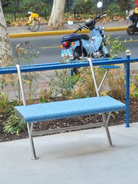
When pouring cement at the entrance of the yard, we invited Sesame, the puppy from the TYAKASHA office, to leave his footprints. The courtyard is surrounded by continuous metal tubes, decorated with solid glass ball lights, and a seat is designed that cannot stand on its own and must be leaned on or connected to the metal tube to be used. Together with second-hand furniture and Shanghai native plants, it forms the courtyard scenery.
When concrete was poured at the courtyard entrance, Sesame, the dog from TYAKASHA’s office, was invited to leave its paw prints in the surface. The courtyard is enclosed by continuous metal tubing and punctuated by solid glass globe lights. ARCHWASTE also designed a chair that cannot stand independently and must lean against or connect to the metal tubing to function. Together with the repurposed furniture and locally sourced plants from Shanghai, these elements form the courtyard landscape.
▼Courtyard seating leaning against blue metal tubing © Dai Cheng/Dai Cheng
ARCHWASTE believes that the construction site itself is a hard-core canvas, and the accuracy of control is not the only criterion, but requires free and high-quality creation so that the space can burst out with more vitality when used.
ARCHWASTE considers the construction site itself a raw canvas. Precise control is not the only measure of design; space also requires free yet considered acts of creation in order to gain greater vitality through use.
▼Metal chair that cannot stand independently/Entrance mirror sign hand-painted by Tong Yun, Metal chair that cannot stand independently/Entrance mirror sign hand-painted by Tong Yun© Dai Cheng/Dai Cheng
▼Floor plan © ARCHWASTE

Complete project information
Project name: TYAKASHA GALLERY
Project type: Commercial retail store
Designer: ARCHWASTE
Company website: https://xhslink.cn/o/AmT47hMLdw5
Contact email: archwaste@163.com
Project Design: 2024
Year of completion: 2024
Design team: Hou Yutong/Yang Yuhang/Wang Ruilong
Project address: Yuyuan Road, Changning District, Shanghai
Building area: 105㎡ (indoor) + 25㎡ (outdoor)
Photography copyright: Dai Cheng
Partner: Construction party: Shanghai Zhuoshan Engineering Management Consulting Co., Ltd.
Client: TYAKASHA
Material: wooden board
Brand: Mu Shu Martin
Credits
Project name: TYAKASHA GALLERY
Project type: Retail Store
Design: ARCHWASTE
Website: https://xhslink.cn/o/AmT47hMLdw5
Contact e-mail: archwaste@163.com
Design year: 2024
Completion Year: 2024
Leader designer & Team: Hou Yutong/Yang Yuhang/Wang Ruilong
Project location: Yuyuan Road, Shanghai, China
Gross built area: 105㎡ (Interior) + 25㎡ (Outdoor)
Photo credit: Dai Cheng
Partner: Contractor: Shanghai Zhuoshan Engineering Management Consulting Co Ltd
Clients: TYAKASHA
Materials: Wood Panels
Brands: MOOSOO
More:ARCHWASTE. More about them:ARCHWASTE on gooood
Source: gooood.cn